Role of Packaging
Packaging is the science, art and technology of protecting products for distribution, storage, sale, and use. Packaging also refers to the process of design, evaluation, and production of packages.
Packaging design has traditionally been viewed as a means of protecting the contents of the package. However, for several decades packaging has been increasingly utilized as a sales canvas on which the product’s attributes and benefits are promoted. Subsequently, packaging design is a contributor to the cost of the end product as well as a part of the product experience itself.
Nowadays, packaging and package labeling have several objectives:
- Physical protection of the product from shock, vibration, compression, temperature, etc.
- Barrier protection from oxygen, water vapor, dust, etc. most often utilized in food packaging in order to keep the contents clean, fresh and sterile for longer, and to extend the product’s shelf life.
- Containment or agglomeration of small objects (or substances, such as liquids, powders and granular materials) in one package in order to increase handling efficiency.
- Information transmission - Packages and labels communicate how to use, transport, recycle, or dispose of the package or product.
- Reducing security risks of shipment through tamper-evident features, authentication seals, security printing, anti-theft devices, etc.
- Convenience - Packages can have features that add convenience in distribution, handling, stacking, display, sale, opening, reclosing, use, dispensing, and reuse.
- Portion control achieved with single-serving or single dosage packaging not only reinforces the precise amount of contents to control usage, but also aids the control of inventory.
- Marketing - encouraging potential buyers to purchase the product by applying marketing communications and graphic design to the surface of the package.
Trends in packaging design
One of the most evident movements in packaging design is a
shift from aesthetics to ethics. In the 80s and 90s packaging designers were mostly concerned with improving aesthetic appeal and sales of the product. They used foil bags, embossed and etched bottles, textured papers, latest print techniques and new materials to enhance product perception and standout.
More recently, packaging designers turned towards
minimalism. Product packaging tends to be simpler and smaller, yet very functional. A growing awareness of the impact of excessive packaging on the environment has driven both designers and consumers towards
green packaging.
Sustainable packaging refers to more than just recycling. It is considered with issues such as a
carbon footprint (the amount of greenhouse gases emitted during the production process, transportation from the source to the points of production, sale and consumption). Packaging designers need to consider the
palette maximization in order to minimize the amount of air that is shipped during transportation and, consequently, the number of shipments required and the greenhouse gases emission.
A good example of such considerations in use is Walmart’s redesigned milk container, which reduced shipping labor by 50 percent and water usage by 60 to 70 percent. The new packaging enables Walmart to stock 224 containers in a space that used to hold 80.
Another important issue is
a life cycle of materials used for packaging. Designers need to consider whether packaging materials come from recycled or sustainable sources and what happens to them after they are used.
The sustainability of the product package can be assessed using the
waste hierarchy, which refers to the
3Rs of reduce, reuse and recycle. Topping the hierarchy,
prevention of waste is the most favoured option. Packaging should only be used when necessary. Ironically, however, avoiding all packaging may actually increase the amount of waste generated. If the product is damaged or degraded the energy lost is far greater than that of the package.
Therefore,
minimization is the second option in waste management strategy. It refers to reducing the volume of packaging to the minimum necessary to perform the protective role of the package. Usually, “reduced” packaging also helps minimize costs.
A third option opened to packaging designers is design for
reuse. It encourages reuse of the package by customers (for instance, by using the package for other purposes) and manufactures (reusing the packaging of the incoming parts for a product, either as packaging for the outgoing product or as part of the product itself).
Recycling is being placed further down the waste hierarchy. The reprocessing of materials into new products encourages the use of primary components such as steel, aluminum, paper or plastic, that are not difficult to separate and do not contaminate recycling operations.
The least favoured options are
energy recovery (using the heat available from packaging components) and
disposal (placement in a sanitary landfill).
Green is Good but... (it doesn't end there)
Having considered the environmental issues, a good packaging designers turns into graphic design and packaging aesthetics in order to attract consumers. It is important that a packaging stands out because, according to various reports, over 70% of purchase decisions are made at point of purchase and a pack on a supermarket shelf has less than three seconds to grab attention.
A product packaging needs to tell a story about the product, needs to communicate the key messages or attributes of the product and needs to convey the brand identity. Incorporating easily recognizable visual equities, such as a shape (e.g. the Perrier bottle), a colour (e.g. yellow for Kodak), an illustration (e.g. the Nike Swoosh) or a name (e.g. “I can’t believe it’s not butter”) can greatly aid the process.
It is true that he difference between a great pack and a disaster is all in the design. There are a number of websites you can visit to find excellent examples of great packaging design. These include:
I used the above resources to find a few really inspirational packaging designs that are both sustainable and aesthetically pleasing.
Boxed Water is Better insists on keeping things simple, sustainable and beautiful. It started with the idea of creating a new bottled water brand that is kinder to the environment - ended up deciding that water shouldn't be bottled at all. About 85% of the Boxed Water container is made from a renewable resource, trees, harvested in a responsible, managed, and ethical way. The boxes are also shipped flat, which is significantly more efficient compared to shipping empty plastic or glass bottles to be filled.
Green Cup created by two young Swedish guys – Gustav Nisser Henrik Lindholm - is an alternative to disposable cups; a reusable mug that gets you discounts while at the same time reducing energy usage, wasted resources and littering. GreenCup creates a network of cafés that all offer the GreenCup mug for sale at a price substantially below market value, as well as a discount when people use their GreenCup mug to buy coffee. The consumer keeps enjoying great coffee at a reduced price and get to help save the environment at almost no effort. This is an excellent example of the 'reduce' and 'reuse' rules at work.
Banana leaves might be used as a new ecological material for take away packages. This deliciously refreshing concept puts many of the most "environmentally friendly" packages on today's market to shame. Banana leaves exist in many regions around the world and last long after they are cut off the trees (sustainably). Their wax-like surface is ideal for wet and greasy foods. They are flexible and, by using die cut technology, can be adapted to many types of packaging. No glue is used. The unique qualities of this material allow packages to be opened simply by tearing the banana leaf along its natural perforation.
The idea developed by an Israeli designer Tal Marco was showcased in Designboom'
"Dining in 2015" design competition.


 Post destacado 1
 Post destacado 6
 Post destacado 7
 Post destacado 2
 Post destacado 3
 Post destacado 4
 Post destacado 5
 Post destacado 8
 Post destacado 9
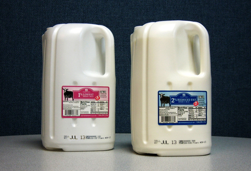


