DESIGN IS A BEHAVIOUR / NOT A DEPARTMENT

Wednesday, 17 February 2010

Who are we?

Coverline Design is a design consultancy specializing in magazine launching and redesign. We offer a broad multi-disciplinary expertise in developing a strong editorial voice, ultra-contemporary look and feel, broad readerships and efficient workflow for periodical publications.

We do understand that magazines are collaborative enterprises. Launching or redesigning a publication must emerge from a shared vision that incorporates editorial, design and business interests.

We realize that an in-house design can be a struggle, requiring not just talent and motivation but also initiative and energy. It means finding extra time within a regular production schedule to reimagine a magazine. It means finding a new visual vocabulary that is different from the one you speak daily.

Coverline Design translates those management, editorial and design concerns into a functioning structure. We recognize that even magazines with similar readerships can have very different souls. We respect and advocate the essence, the attitude and the personality of every publication.

What do we offer?

Depending on your publication needs, Coverline Design offers three major redesign services:

1. Updating – improved look without a change in content:

  • changing the look and feel of the magazine without modifying the editorial voice and character of the publication;
  • gradual updating of the particular design elements;
  • a refreshing of the title rather than an extreme makeover (change in colour palette, signage, typography, image style, logo, cover, etc.);
2. Restructuring - modifying the editorial content without replacing it with a new one:
  • making the content more inviting, more accessible and revitalized in order to recapture advertiser or readers who have drifted off;
  • reordering a format that has become unwieldy or ineffective in places;
  • introducing new ways of presenting information.
3. Repositioning – a total makeover of the editorial content and a visual style:
  • changing not just the physical form of the publication but who is reading it as well.
While updating introduces a new look and restructuring may involve new approaches to storytelling, a repositioning alters the entire publication’s DNA. The name may be the same, but the result of the redesign is a fundamentally different magazine aiming to reach out and capture a different market.

While the third and most severe stage of redesign might seem risky, for some publications it is a matter of life and death. If a magazine has covered a topic that no longer resonates with a sustainable readership, then it must expand or change its topic. If a readership is aging with the magazine, new readers must eventually be found. Turning-off old readers is a calculated decision taken to attract new enthusiastic readers of a different age or income level.

Coverline Design understands that magazines are carefully balanced ecosystems, and it can be hard to make minor adjustments without setting off a cascade of visual issues. Therefore, we always seek to establish authority and build consensus for a redesign.

When do you need a redesign?

We live in the age of tremendous change, many readers lose interest in a publication that looks as though it is standing still. In the past most magazines needed a redesign every seven years. Now, large newsstand titles seem to change every three or four years. And, if they are aimed at young audiences, two years is a norm.

The credit (or the blame) for this quickening of the redesign circle goes to the Web. The Internet has raised the overall level of visual literacy and created an expectation for freshness among readers. Magazines must run to stay in place.

Coverline Design recognizes the importance of regular, well-executed redesign and offers the expertise in both editorial management and graphic design to deliver successful design solutions when:
  • Your editorial message has changed;
  • Your audience has changed;
  • Your staff has changed;
  • Your production and distribution methods have changed;
  • Readers attitudes changed;
  • Advertiser attitudes changed;
  • Your competition has changed.
If any of the above seven applies to your publication, a redesign may be in your future. If not, a redesign may be a smart strategy for staying ahead. Leaders are proactive. They deal with a problem before it becomes one.

Tuesday, 16 February 2010

Retrospective

Wayfinding encompasses all of the ways in which people orient themselves in physical space and navigate from place to place. The term is being used in the context of architecture to refer to the user experience of orientation and choosing a path within the built environment, and it also refers to the set of architectural and/or design elements that aid orientation.

According to David Gibson (2009), three writers are largely responsible for popularizing the term wayfinding. In 1960, an urban planner Kevin Lynch explained the term in his landmark book, The Image of the City, as the process of forming a mental picture of one's surroundings based on sensation and memory. The subject was than explored further in Wayfinding in Architecture by Romedi Passini and Wayfinding: People, Signs, and Architecture, which Passini coauthored with Paul Arthur in 1992.

In addition to coining the term signage, Arthur also developed innovative wayfinding projects and eventually became a fellow of the Society for Environmental Graphic Design (SEGD), which today serves architects, planners, graphic designers, exhibition designers, product and interior designers who practice wayfinding. The SEGD annual competitions and website recognize outstanding achievements and innovation within the field.

Over time, environmental graphic design became the preferred umbrella term to describe any communications intended for spatial application, ranging from wayfinding sign programs to branded spaces, exhibitions, and even public art.

Trends

Just like any other aspect of design, wayfing is a subject to trends and fashions. Contemporary wayfinding design tends to be bigger and bolder than before. Tiny signs and arrows are often replaced with oversized typography placed on walls, floors and even ceilings. Letters and signs are sometimes distorted to fit the space. In 2006 Paula Scher and her collegues at Pentagram used the method in the design for Bloomberg L.P. Corporate Headquarters in New York. The project won the SEGD Honor Award. Two years later, Eureka Tower Carpark in Melbourne became another excellent example.

However, according to Mark VanderKlipp (2007), “one of the hottest trends in wayfinding these days is interactive digital signage—the use of electronic kiosks and flat-panel screens that display instantly updated information of a user's choice”. As price points for LCD and plasma display technologies have come down in the last several years, digital signage has grown in prominence. Still, the channel remains young, its borders not entirely defined, and its potential vast (Frankel 2009).

Regardless of the designer's preferred materials and means of communication, a good signage design not only helps to navigate through the environment, but also represents a brand and communicates the host's intended messages. An inspiring example of such practice is a BrandCulture Communications design for Mirvac WA.

Concept Innovation, Strengths and Weaknesses 

BrandCulture is an Australian design company specializing in creating branded environments and visual communications for retail, corporate headquarters, office and multi-residential developments.

The Mirvac WA brief was to differentiate the environment to reflect the local culture and independence that Perth has within Australia and consider a new way to reflect the ‘living line’ and brand values.

The ‘living line’ concept had been used in the Sydney office to great effect and again formed the backbone to this branded environment albeit in an edgier, more graphic form. The ‘living line’ starts in the reception and leads through the office across tiled and carpeted floors traversing walls, wooden beams and glass meeting rooms to ceiling tiles and down pin boards creating a sense of connectivity as well as guiding visitors through the building.

Rooms are subtly numbered using gloss grphic finishes applied to the matt painted walls and across the glass doors. The line connects all of the meeting rooms and spaces, each named after a landmark project. The names are inlaid into he the carpets outside the meeting rooms.

Graphics across the 30 meters of office ceiling highlight satellite meeting areas and connect the space with the main meeting rooms. They also help to navigate through this large space without walls.

The 'living line' interact with the brand values, which are laser cut into the red anodised aluminium beams laid into the pin boards. This has been designed to introduce the company values to visitors and to  reinforce the company's identity.

In my opinion, the 'living line' concept is a simple yet very effective way of organizing a complex office environment. It not only guides visitors from the reception to the heart of the office but also creates a sense of connectivity, demonstrates the company's commitment to building communities, creating connections and sharing success. 


Monday, 15 February 2010

Helvetica (2007), produced and directed by Gary Hustwit, is a famous documentary about typography, graphic design and global visual culture, which looks at the proliferation of one typeface as a part of a larger conversations about the way type affects our lives. Following the screening of the film, I was asked to select and analyze two typefaces discussing the designers influences and the fonts' characteristics, strengths and weaknesses. I chose a modern slab serif  typeface called Clarendone that seems to regain its original popularity in a very different post-modern environment as well as an extremely elegant and contemporary sans serif Kozuka Gothic Pro. 


Clarendon is a slab-serif typeface that was created in England by Robert Besley for the Fann Street Foundry in 1845. Clarendon is considered the first registered typeface, with the original matrices and punches remaining at Stephenson Blake and later residing at the Type Museum, London. It was revised by Hermann Eidenbenz in 1953.

The font design was influenced by common wanted posters in American Old West as well as the government proclamations of the German Empire during the World War I.

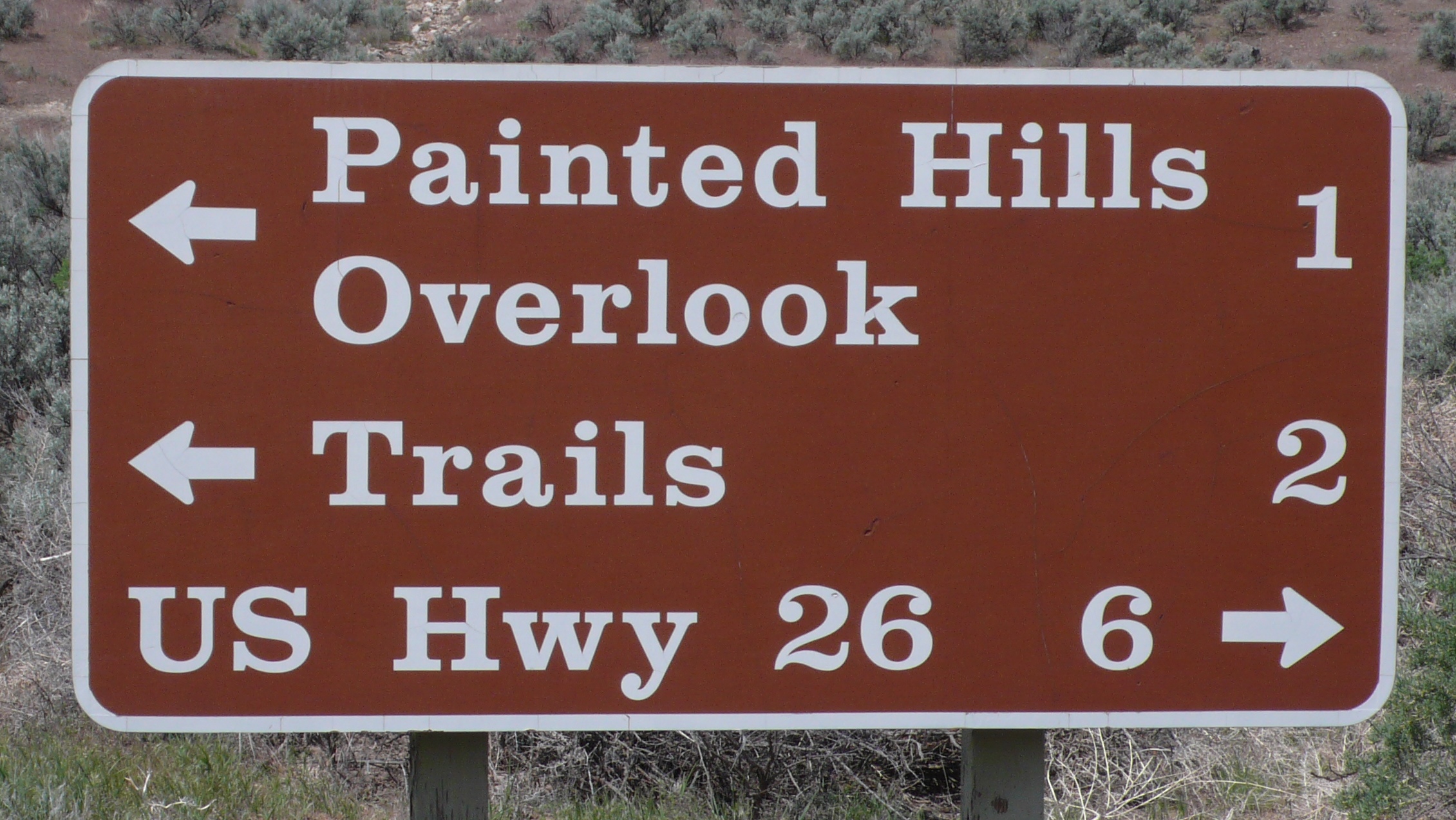
Until recently, Clarendon Bold was used on a U.S. National Park Service signs. In 2008, the typeface was utilized extensively by the Ruby Tuesday restaurant chain in the re-launch of their corporate identity. The same year the font was used by the Norwich Union building society in rebranding exercise. Clarendon can also be seen in the logotypes of corporations such as Sony, Pitchfork Media, and Wells Fargo.

Clarendon is classified as a slab serif font which hybridize the bold presentation of a sans-serif and the horizontal stress of a serif face, characterized by an overall consistency in stroke weight. The serifs and the stems are of a similar weight. The body of a slab serif is often wider than what is considered normal.

Clarendon is a dynamic typeface full of contrasts. It can be distinguished by a contrast between angular serifs and round terminals (for example: r, g, a, y). There is also a contrast within a single stroke - flaring in thickness from the middle point of the stem outwards to the terminal (modulation). The speed of transition between thicker and thinner strokes (ductus) is rather vigorous making the typeface feel more active and energetic. The angular and rigid serifs contrast also with elliptical eyes and curvy bowls and shoulders.

Claredon’s joints are rather smooth with curves flowing into the stems with slow ductus giving the face slightly more relaxed and casual feel.
The relatively small x-height, shallow descenders and small counters give the face condensed, yet bold and legible feeling.

According to Return of the Serif by Scott Billings (Design Week January 2009) slab serifs are returning as a trend in magazines and newspapers. In 2005 The Guardian’s redesign led to the iconic Helvetica headers being replaced with slab serif font Guardian Egyptian.
Most serif typefaces are being redesigned to be used in display and advertising. Serifs now are much bolder and “in-your-face” even thought they are still traditional in some ways.

Wednesday, 27 January 2010

Introduction

HoneyHome.com is a design project that revolves around the notion of a community focal point. Its aim was to “develop a new service through which a supermarket engages on a local level with its customers and other in the community […] to increase the resourcefulness of the local community and individuals” (RSA Design Directions, 2009, p.17).

The project responds to the brief with four distinctive elements: a concept, a wall-size touch-screen device, an associated website and a promotional campaign.

In this paper, I intend to critically assess the project by looking into its key stages: (i) research and strategy, (ii) design concept, (iii) design development, (iv) implementation, and (v) evaluation.

Research and strategy

I used many different methods of research throughout the project. I conducted an extensive secondary research into the role of media in building and maintaining communities, the changeable nature of communities, the future of magazines, existing community projects, tangible technologies and relevant issues for design.

While investigating touch-screen technologies and their possible applications within local communities, I combined the secondary research with observation techniques. I collected web-sourced images of digital kiosks, community notice boards and other touch-screens used for information, education or retail purposes. More importantly, I took my own photographs of such devices in museums (Science Museum, National History Museum) and on the streets of my local town.

Similarly, while collecting information about existing local magazines I used qualitative and quantitative methods of data analysis in order to gain a better understanding of the market and its dynamics.

Other primary research methods were also widely used. I interviewed an expert on magazine industry to test my initial ideas. The peers and tutors feedback was often considered. In addition, I kept discussing my work in progress with colleagues, friends and family as the project was targeted at all supermarket customers, people of different classes, cultures, ages and lifestyles.

Finally, I used methods of visual exploration, such as mind maps, sketches, mock-ups, storyboards and diagrams to organize my thoughts and research findings. I believe that by combining all of the above methods, I based my project on solid and sufficient research. Consequently, I was able to better understand the project brief and formulate clear strategic objectives for the project.

Design Concept

During the early stages of the concept development, I planned to incorporate the notions of community networking and cooperation into my design by comparing it to the DNA structure. However, I realized that to my targeted audience the DNA’s scientific and medical associations might be unfamiliar, confusing and difficult to understand. Therefore, I decided to modify the concept and the ‘community DNA’ became the ‘community honeycomb’.

As opposed to a DNA, honey is a popular grocery product that can be seen, touched, smelled and tasted. “Honey is a symbol of richness and sweetness in all traditions. In the sacred texts of East and West, milk and honey flow like a stream through the Promised Land. The Celtic traditions celebrate mead as an immortal beverage. In Greek mythology, in which honey is the drink of the gods of Olympus, it is the symbol of knowledge, learning and wisdom” (Bernard Michaud, [n.d.], [n.p.]). Moreover, the very concept of networking derived from social insects, such as bees. “As the workers of the hive, bees are symbol of an industrious and prosperous community” (Bernard Michaud, [n.d.], [n.p.]).

Design Development

I successfully incorporated these good associations into my designs by using a hexagon motif throughout the project. Simple geometric shapes are known to carry symbolic, easily identifiable meanings and messages. While circle stands for unity and a squire for stability, a hexagon represents colabaration - a key characteristic of a prosperous community.

The honeycomb inspired also the project name, which evolved from the ‘Community Honeycomb’ to the ‘HoneyHome.com’, which sounds more playful and points towards the online presence of the project. Consequently, the in-store, wall-size, digital device was named ‘The Hive’.

I used images of honeycombs to develop the colour palette for the project. Shades of bright yellow, golden, warm orange and lime green enhance the concept by expressing the associations with sun, summer and harvests.

I selected two contrasting typefaces: Helvetica (for body text and secondary text) and Hobo (for logos). The feedback I received during the post-production tutorial suggested that the Hobo font, originally created in 1910 by Morris Fuller Benton, might be a little dated as it referred to the Art Nouveau style. I do understand this argument, but after considering modern alternatives I decided to keep the original font because of its organic, floral motifs, as well as highly-stylized, flowing curvilinear forms and friendly personality. I do feel that it is suitable for HoneHome.com project.

Design Implementation

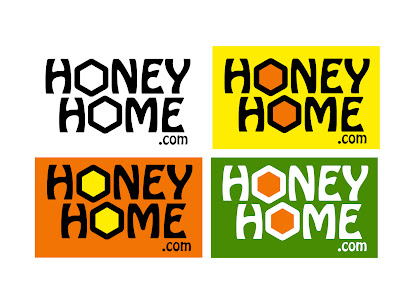
I believe I developed a very original and unique logo for the project and campaign by intersecting horizontally and the words: ‘honey’, ‘home’ and ‘.com’ as well as replacing the common ‘O’ with a yellow hexagon.

I designed the ‘home screen’ for the in-store device and its website, as well as a simple promotional campaign. The ‘Sweet Campaign’ involves printing the HoneyHome.com logo with a catchy slogan, such as “Sweetening Your Local Community” or “Buzzing With Activity”, on supermarkets’ carrying bags, shopping baskets and trolleys. Similarly, locally-sourced honey could be used for promotional purposes.

Evaluation

I believe that I managed to successfully develop the HoneHome.com concept. However, its implementation could be further improved. The interfaces for the device applications as well as the website need to be developed.

Similarly, the campaign could be extended further. I thought about designing a system of floor signs that would point customers from different parts of the supermarket towards ‘The Hive’ and encourage them to interact with the device. The label for the ‘Homely Honey’ jar I created for the campaign also needs to be redesigned. I feel that my packaging design skills were insufficient on this occasion.

This might be due to the fact that I spent most of my time on the project working on the concept development and was left short of time during the design implementation stage. If I were to work on a similar project again, I would manage my time more efficiently.

Also, I would make my research more structured, systematic and objective, especially in the post-production stage of the project. I would try to develop a prototype of the HoneyHome.com website in order to show more detail about the possible applications of the concept. The prototype would have allowed me to accurately test the functionality of The Hive among the targeted audience and to improve the design of the device and the website.

In terms of professional growth, I feel that I have leant a lot on this project. I extended my academic and industry knowledge and improved my practical design skills. Taking into consideration that I come from journalistic rather than graphic design background, I did find the project quite challenging. However, I truly enjoyed that challenge and I am looking forward to utilize my newly acquired skills in the future.

Conclusion

In general, I find my project successful. I believe that, despite its weaknesses and limitations, HoneyHome.com has a potential to restore the community focal point. I think that I managed to develop a practical design solution to problems outlined by the project brief and investigated through various methods of research. In my opinion, the project offers the unique balance between the interests of supermarkets, individuals and existing communities. It shows how supermarkets could “demonstrate commitment to their locality and create bonds of reciprocity between themselves, their customers and the greater community” (RSA Design Directions, 2009, p.17).


References

Bernard Michaud (n.d.). Mythology of Bees Honey [online]. Available from: www.lunedemiel.tm.fr/anglais/06.htm [Accessed: 15 January 2010].

RSA Design Directions (2009). The Resourceful Supermarket [online]. Available from: www.rsadesigndirections.org/projects/projects6.html [Accessed: 10 October 2009].


Bibliography

Anderson, W.T. (1999) Communities in a World of Open Systems. Futures. 31(5), 457-463.

Bernard Michaud (n.d.). Mythology of Bees Honey [online]. Available from: www.lunedemiel.tm.fr/anglais/06.htm [Accessed: 15 January 2010].

Churchill, E.F., Nelson, L. and Denoue, L. (2003). Multimedia Flyers: Information Sharing with Digital Community Bulletin Boards [online]. Available from: www.fxpal.com/publications/FXPAL-PR-03-198.pdf [Accessed: 16 November 2009].

Dorf, D. (2008). Web 2.0 Honeycomb [online]. Available from: http://blogs.oracle.com/retail/2008/12/web_20_honeycomb.html [Accessed: 27 November 2009].

Leight, S. (2008). Supermarkets are evil: what a shame we love Tesco and Waitrose so [online]. Available from: www.telegraph.co.uk/comment/columnists/samleith/3563175/Supermarkets-are-evil-what-a-shame-we-love-Tesco-and-Waitrose-so.html [Accessed: 23 October 2009].

Michaels, L. (2001). What’s Wrong with Supermarkets [online]. Available from: http://archive.corporatewatch.org/publications/agriculture/www_sm_v4.pdfAccessed: 23 October 3009).

Ribeirinho, A. (2007). The User Experience Honeycomb [online]. Available from: http://blog.delaranja.com/the-user-experience-honeycomb/ [Accessed: 27 November 2009].

RSA Design Directions (2009). The Resourceful Supermarket [online]. Available from: www.rsadesigndirections.org/projects/projects6.html [Accessed: 10 October 2009].

Slattery, J. (2009). Local Media’s Community Building Role at Risk [online]. Available from: http://jonslattery.blogspot.com/2009/05/local-medias-community-building-role-at.html [Accessed: 4 November 2009].

Smith, G. (1995).Virtual Community in Real Reality [online]. Available from: www.partnerships.org.uk/itf/virtreal.html (Accessed: 10 November 2009).

Thursday, 17 December 2009

What is this?
This is a copy of the presentation I gave today for my peers in the MA Design for Communication class. It uses a very new and innovative technique that I learnt recently from Liana. It is very simple to use, yet looks dynamic and very exciting. It doesn't present slides in linear order like PowerPoint. It's more user-oriented and interactive. Think about it as a big canvas when you can zoom in and out on different object.

How to view the presentation?
There are two methods you can use to view the presentation. Whichever you choose, open the presentation in the full-screen mode first by clicking on the button in the bottom right corner of the window.
Then, (1) simply press the 'play' button in order to process with the presentation in order we viewed it in the classroom. But remember, the presentation was interactive and viewers could choose the places they wanted to visit first on the map of the world.
Therefore, I would recommend that you view the presentation in the order of your individual choice (2). It's like a journey around the world! You can zoom in on any object (picture, text, frame) by clicking on it. Zoom out by pressing the 'space' button on your keyboard. Be adventurous and explore. I am sure you will have a lot of fun with it.
The word of introduction before you start exploring
I chose ethnic masks as a subject of my presentation because I am very interested in original and 'pure' culture. I am attracted to 'pure' custom, tribal traditions, cultures that evolved in isolation from Western influences.
And there is something incredibly mysterious and enigmatic about masks. They are used for protection from real and imagined dangers, for concealment, performance or amusement.
Masks have been used since antiquity for both ceremonial and practical purposes. They are usually worn on the face, although they may also be positioned for effect elsewhere on the wearer's body, so in parts of Australia giant totem masks cover the body, whilst Inuit women use finger masks during storytelling and dancing.
Throughout the world masks are used for their expressive power as a feature of masked performance - both ritually and in various theatre traditions. Masks are also a familiar and vivid element in many folk and traditional pageants ceremonies, rituals and festivals, and are often of an ancient origin. The function of the masks may be magical or religious; they may appear in rites of passage or as a make-up for a form of theatre. Equally masks may disguise a penitent or preside over important ceremonies; they may help mediate with spirits, or offer a protective role to the society who utilizes their powers.

The presentation is also available online at:


My collection
Finally, this is a pick from my personal collection. They are not the original tribal artworks. I buy them on ebay. They were probably produced as souvenirs for tourists, but still, I find them fascinating and inspiring.


After weeks of intensive work I have submitted my boards for the RSA 2009/10 competition.
Below you will find the presentation of my project along with the project report I also submitted.


Project Report

The HoneyHome.com is a design project that revolves around the notion of a community focal point. It challenges the argument that large retail corporations are destructive to local communities. Since a local supermarket is a physical place that every member of the community visits frequently, it could, potentially, play an important role in the community life. The HoneyHome.com recognizes that opportunity and provides a new-age community focal point by introducing a new channel for multilevel communication, called ‘The Hive’.

The research into the existing and historic communities revealed that the nature of interaction between people is changing as a direct result of a rapid development in information and communication technologies. As the nature of human interactions changed, we moved away from the traditional model of community. In the ‘Digital Age’ the communities are no longer closed systems with clear geographic boundaries, stable memberships and few linkages with other communities. Instead, they are fragmented, geographically dispersed and, to a large extend, virtual or placeless.

I began to investigate the methods of restoring the lost community focal point locally by improving the communication between communities, supermarkets and individuals. Taking into consideration the role of local media in building and maintaining communities, I thought about designing a local magazine produced by the collaboration of a supermarket with journalism and design students from a local university. It seemed to solve the problem temporarily, but a steady decrease in popularity of print media made me look at digital and more future-friendly alternatives.

Inspired by an ever-increasing use of tangible technologies in our everyday life, I decided to design a digital device, which would create and reinforce links between local communities, supermarkets and their customers. And my idea - The Hive – took a form of a wall-size, multi-touch screen that allows several users to interact with its contents and with each other at the same time.

The very concept of networking derived from social insects, such as ants and bees, therefore, I based the interface design around a simple graphic representation of a honeycomb - the hexagon motif. It represents collaboration and, therefore, illustrates the key characteristic of a vibrant community. The honeycomb inspired the project name and the colours used for the campaign development.

HoneyHome.com does not require extensive advertising. The target audience comes to supermarkets regularly and a wall-size tangible device is almost certain to create a positive buzz within the community. However, in order to encourage people to use ‘The Hive’ and the associated website, a number of promotional activities are recommended.

The campaign logo with a catchy slogan, for example “Sweetening Your Local Community” or “Buzzing With Activity”, could be printed on carrying bags or on shopping baskets and trolleys. Similarly, locally sourced honey could be used for promotional purposes. A label branded with HoneyHome.com logo would inform people about the new service. Given away for free at the launch of the campaign, the honey would also help to leave a sweet and homely flavour on the community taste buds.

Wednesday, 2 December 2009

I wonder how often professional designers can't sleep because of their projects?


I can't sleep almost every night. I go to bed and as soon as I close my eyes the images of my project attack me from everywhere.

Sometimes, it is not such a bad thing. Apparently, the middle-of-the-night ideas might be quite useful as they are normally a little detached from what we're working on.

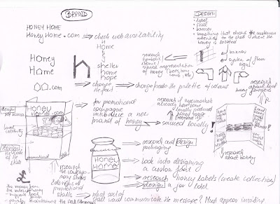
Yesterday, one of those midnight persuasive thoughts made me change the title of the project from the 'Community Honeycomb' to 'Honey Home' only because the second one rhymes with 'dot.com'.

So I could have 'HoneyHome.com' and my Touch Screen Wall was meant to be accompanied by a website anyway. But this is just a beginning. I could design a campaign logo, banner, floor signs, promotional stall... even a honey jar and label that promotes the idea but also generates profit (needed in order to pay for administrator and maintenance of the Wall).

Searching for 'honey' on Waitrose.com returns over a hundred results. Surely, one of those honey jars could be locally sourced and labeled as 'Honey Home'.

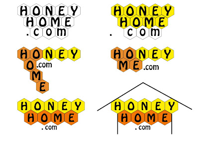
Following the night-time stroke of genius (ha, ha!!!), I started working on potential logos for my project.


Which style will work best for my project?