




Introduction
HoneyHome.com is a design project that revolves around the notion of a community focal point. Its aim was to “develop a new service through which a supermarket engages on a local level with its customers and other in the community […] to increase the resourcefulness of the local community and individuals” (RSA Design Directions, 2009, p.17).
The project responds to the brief with four distinctive elements: a concept, a wall-size touch-screen device, an associated website and a promotional campaign.
In this paper, I intend to critically assess the project by looking into its key stages: (i) research and strategy, (ii) design concept, (iii) design development, (iv) implementation, and (v) evaluation.
Research and strategy
I used many different methods of research throughout the project. I conducted an extensive secondary research into the role of media in building and maintaining communities, the changeable nature of communities, the future of magazines, existing community projects, tangible technologies and relevant issues for design.
While investigating touch-screen technologies and their possible applications within local communities, I combined the secondary research with observation techniques. I collected web-sourced images of digital kiosks, community notice boards and other touch-screens used for information, education or retail purposes. More importantly, I took my own photographs of such devices in museums (Science Museum, National History Museum) and on the streets of my local town.
Similarly, while collecting information about existing local magazines I used qualitative and quantitative methods of data analysis in order to gain a better understanding of the market and its dynamics.
Other primary research methods were also widely used. I interviewed an expert on magazine industry to test my initial ideas. The peers and tutors feedback was often considered. In addition, I kept discussing my work in progress with colleagues, friends and family as the project was targeted at all supermarket customers, people of different classes, cultures, ages and lifestyles.
Finally, I used methods of visual exploration, such as mind maps, sketches, mock-ups, storyboards and diagrams to organize my thoughts and research findings. I believe that by combining all of the above methods, I based my project on solid and sufficient research. Consequently, I was able to better understand the project brief and formulate clear strategic objectives for the project.
Design Concept
During the early stages of the concept development, I planned to incorporate the notions of community networking and cooperation into my design by comparing it to the DNA structure. However, I realized that to my targeted audience the DNA’s scientific and medical associations might be unfamiliar, confusing and difficult to understand. Therefore, I decided to modify the concept and the ‘community DNA’ became the ‘community honeycomb’.
As opposed to a DNA, honey is a popular grocery product that can be seen, touched, smelled and tasted. “Honey is a symbol of richness and sweetness in all traditions. In the sacred texts of East and West, milk and honey flow like a stream through the Promised Land. The Celtic traditions celebrate mead as an immortal beverage. In Greek mythology, in which honey is the drink of the gods of Olympus, it is the symbol of knowledge, learning and wisdom” (Bernard Michaud, [n.d.], [n.p.]). Moreover, the very concept of networking derived from social insects, such as bees. “As the workers of the hive, bees are symbol of an industrious and prosperous community” (Bernard Michaud, [n.d.], [n.p.]).
Design Development
I successfully incorporated these good associations into my designs by using a hexagon motif throughout the project. Simple geometric shapes are known to carry symbolic, easily identifiable meanings and messages. While circle stands for unity and a squire for stability, a hexagon represents colabaration - a key characteristic of a prosperous community.
The honeycomb inspired also the project name, which evolved from the ‘Community Honeycomb’ to the ‘HoneyHome.com’, which sounds more playful and points towards the online presence of the project. Consequently, the in-store, wall-size, digital device was named ‘The Hive’.
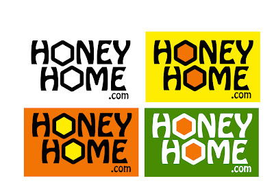
I used images of honeycombs to develop the colour palette for the project. Shades of bright yellow, golden, warm orange and lime green enhance the concept by expressing the associations with sun, summer and harvests.
I selected two contrasting typefaces: Helvetica (for body text and secondary text) and Hobo (for logos). The feedback I received during the post-production tutorial suggested that the Hobo font, originally created in 1910 by Morris Fuller Benton, might be a little dated as it referred to the Art Nouveau style. I do understand this argument, but after considering modern alternatives I decided to keep the original font because of its organic, floral motifs, as well as highly-stylized, flowing curvilinear forms and friendly personality. I do feel that it is suitable for HoneHome.com project.
Design Implementation
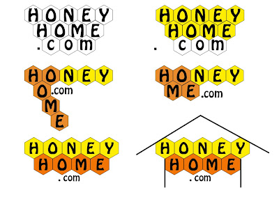
I believe I developed a very original and unique logo for the project and campaign by intersecting horizontally and the words: ‘honey’, ‘home’ and ‘.com’ as well as replacing the common ‘O’ with a yellow hexagon.
I designed the ‘home screen’ for the in-store device and its website, as well as a simple promotional campaign. The ‘Sweet Campaign’ involves printing the HoneyHome.com logo with a catchy slogan, such as “Sweetening Your Local Community” or “Buzzing With Activity”, on supermarkets’ carrying bags, shopping baskets and trolleys. Similarly, locally-sourced honey could be used for promotional purposes.
Evaluation
I believe that I managed to successfully develop the HoneHome.com concept. However, its implementation could be further improved. The interfaces for the device applications as well as the website need to be developed.
Similarly, the campaign could be extended further. I thought about designing a system of floor signs that would point customers from different parts of the supermarket towards ‘The Hive’ and encourage them to interact with the device. The label for the ‘Homely Honey’ jar I created for the campaign also needs to be redesigned. I feel that my packaging design skills were insufficient on this occasion.
This might be due to the fact that I spent most of my time on the project working on the concept development and was left short of time during the design implementation stage. If I were to work on a similar project again, I would manage my time more efficiently.
Also, I would make my research more structured, systematic and objective, especially in the post-production stage of the project. I would try to develop a prototype of the HoneyHome.com website in order to show more detail about the possible applications of the concept. The prototype would have allowed me to accurately test the functionality of The Hive among the targeted audience and to improve the design of the device and the website.
In terms of professional growth, I feel that I have leant a lot on this project. I extended my academic and industry knowledge and improved my practical design skills. Taking into consideration that I come from journalistic rather than graphic design background, I did find the project quite challenging. However, I truly enjoyed that challenge and I am looking forward to utilize my newly acquired skills in the future.
Conclusion
In general, I find my project successful. I believe that, despite its weaknesses and limitations, HoneyHome.com has a potential to restore the community focal point. I think that I managed to develop a practical design solution to problems outlined by the project brief and investigated through various methods of research. In my opinion, the project offers the unique balance between the interests of supermarkets, individuals and existing communities. It shows how supermarkets could “demonstrate commitment to their locality and create bonds of reciprocity between themselves, their customers and the greater community” (RSA Design Directions, 2009, p.17).
References
Bernard Michaud (n.d.). Mythology of Bees Honey [online]. Available from: www.lunedemiel.tm.fr/anglais/06.htm [Accessed: 15 January 2010].
RSA Design Directions (2009). The Resourceful Supermarket [online]. Available from: www.rsadesigndirections.org/projects/projects6.html [Accessed: 10 October 2009].
Bibliography
Anderson, W.T. (1999) Communities in a World of Open Systems. Futures. 31(5), 457-463.
Bernard Michaud (n.d.). Mythology of Bees Honey [online]. Available from: www.lunedemiel.tm.fr/anglais/06.htm [Accessed: 15 January 2010].
Churchill, E.F., Nelson, L. and Denoue, L. (2003). Multimedia Flyers: Information Sharing with Digital Community Bulletin Boards [online]. Available from: www.fxpal.com/publications/FXPAL-PR-03-198.pdf [Accessed: 16 November 2009].
Dorf, D. (2008). Web 2.0 Honeycomb [online]. Available from: http://blogs.oracle.com/retail/2008/12/web_20_honeycomb.html [Accessed: 27 November 2009].
Leight, S. (2008). Supermarkets are evil: what a shame we love Tesco and Waitrose so [online]. Available from: www.telegraph.co.uk/comment/columnists/samleith/3563175/Supermarkets-are-evil-what-a-shame-we-love-Tesco-and-Waitrose-so.html [Accessed: 23 October 2009].
Michaels, L. (2001). What’s Wrong with Supermarkets [online]. Available from: http://archive.corporatewatch.org/publications/agriculture/www_sm_v4.pdfAccessed: 23 October 3009).
Ribeirinho, A. (2007). The User Experience Honeycomb [online]. Available from: http://blog.delaranja.com/the-user-experience-honeycomb/ [Accessed: 27 November 2009].
RSA Design Directions (2009). The Resourceful Supermarket [online]. Available from: www.rsadesigndirections.org/projects/projects6.html [Accessed: 10 October 2009].
Slattery, J. (2009). Local Media’s Community Building Role at Risk [online]. Available from: http://jonslattery.blogspot.com/2009/05/local-medias-community-building-role-at.html [Accessed: 4 November 2009].
Smith, G. (1995).Virtual Community in Real Reality [online]. Available from: www.partnerships.org.uk/itf/virtreal.html (Accessed: 10 November 2009).
Wednesday, 27 January 2010
Thursday, 17 December 2009
After weeks of intensive work I have submitted my boards for the RSA 2009/10 competition.
Below you will find the presentation of my project along with the project report I also submitted.


The HoneyHome.com is a design project that revolves around the notion of a community focal point. It challenges the argument that large retail corporations are destructive to local communities. Since a local supermarket is a physical place that every member of the community visits frequently, it could, potentially, play an important role in the community life. The HoneyHome.com recognizes that opportunity and provides a new-age community focal point by introducing a new channel for multilevel communication, called ‘The Hive’.
The research into the existing and historic communities revealed that the nature of interaction between people is changing as a direct result of a rapid development in information and communication technologies. As the nature of human interactions changed, we moved away from the traditional model of community. In the ‘Digital Age’ the communities are no longer closed systems with clear geographic boundaries, stable memberships and few linkages with other communities. Instead, they are fragmented, geographically dispersed and, to a large extend, virtual or placeless.
I began to investigate the methods of restoring the lost community focal point locally by improving the communication between communities, supermarkets and individuals. Taking into consideration the role of local media in building and maintaining communities, I thought about designing a local magazine produced by the collaboration of a supermarket with journalism and design students from a local university. It seemed to solve the problem temporarily, but a steady decrease in popularity of print media made me look at digital and more future-friendly alternatives.
Inspired by an ever-increasing use of tangible technologies in our everyday life, I decided to design a digital device, which would create and reinforce links between local communities, supermarkets and their customers. And my idea - The Hive – took a form of a wall-size, multi-touch screen that allows several users to interact with its contents and with each other at the same time.
The very concept of networking derived from social insects, such as ants and bees, therefore, I based the interface design around a simple graphic representation of a honeycomb - the hexagon motif. It represents collaboration and, therefore, illustrates the key characteristic of a vibrant community. The honeycomb inspired the project name and the colours used for the campaign development.
HoneyHome.com does not require extensive advertising. The target audience comes to supermarkets regularly and a wall-size tangible device is almost certain to create a positive buzz within the community. However, in order to encourage people to use ‘The Hive’ and the associated website, a number of promotional activities are recommended.
The campaign logo with a catchy slogan, for example “Sweetening Your Local Community” or “Buzzing With Activity”, could be printed on carrying bags or on shopping baskets and trolleys. Similarly, locally sourced honey could be used for promotional purposes. A label branded with HoneyHome.com logo would inform people about the new service. Given away for free at the launch of the campaign, the honey would also help to leave a sweet and homely flavour on the community taste buds.
Wednesday, 2 December 2009
I wonder how often professional designers can't sleep because of their projects?

Monday, 30 November 2009

Sunday, 29 November 2009
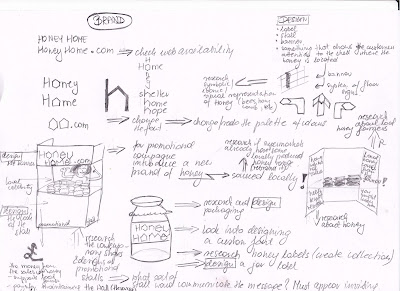
I spend a day researching possible colour themes for my designs.


Friday, 27 November 2009

- Useful - All potential supermarket customers should feel the need to use the device;
- Usable - The device should be easy to use for someone with a minimum or none computer knowledge (children and the elderly);
- Desirable - The screen should look attractive and tempting (trendy);
- Valuable - The device should be valued among its users (but it will only be possible if the device responds to the community needs, serves the community);
- Findable - It surely needs to be easy to locate (and there is no better place to put the thing that a supermarket becauce supermarkets have been playing the role of the community focal point for a while now);
- Accessible - The screen needs to be placed close to main entrance in order to make sure that every customer walking through that door notices it, but also, to attract passers-by.
- Credible - And obviously, all the information available for the screen's users should be reliable. The screen's administrator (there surely should be one) would have to be responsible, as much as possible, for checking the information.


Thursday, 26 November 2009
This post features the results of another mapping exercise.
- location,
- audience,
- contents,
- practices around contents,
- community functions.


- Community:
News - updated daily, automatically generated by local media;
Events - community generated;
Board - an electronic, community generates notice board containing customer advertisements;
Maps - maps of the local area featuring community points of interests and local businesses (paid advertisement);
Faces - a social networking application allowing users to create an online profile, share their interests, archive posts and communicate with other users;
Talent Bank - an application allowing users to advertise their talents and/or special interests and exchange them for services of other users, for example spanish lessons in exchange for piano lessons.
- Activity:
Canvas - a simple application allowing users to draw and create similar artworks, and share them with other users via digital gallery;
Puzzle - an interactive game allowing multiple users to work together to create a big image by dragging and moving around its small pieces (all images to be sourced locally: landscapes, local photographers, local models);
Games - other similar games.
- Shopping:
Food - an interactive database of grocery products available in the supermarket, alongside with recipes, food guides (cheese, fish, etc.) featuring dish of the day, ethnic foods, customers' comments and reviews;
Drink - a similar database showcasing wine of the day, information about grape varieties, origins, history, etc.;
Style - a guide to fashion available in stores that sell clothing, featuring latest fashion trends, accessories, customers' comments and reviews;
Books - a local readers' club, featuring books available in store, book of the week and customers' reviews;
Movies - a similar local fun-club for film, cinema, DVDs available in store;
Music - an application for all music-fanatics featuring expert and customers' reviews of music albums available in store as well as sample music tracks available for customers to listen;
Games - another application that enables users to review latest games releases, etc.
Friday, 20 November 2009
 I went today to see a few exhibitions at the V&A, the Science Museum and the Natural History Museum. And no, I was not going after the Indian Raj, not after the models of a spaceship and not after countless species of insects. I was chasing interactive, touch-sensitive screens, their design and technology. The trip has surely reinforced my believe in the digitalization of our world. It seems that if you want your exhibition to be successful you need to go for the interactive exhibits, something that people can play with, something that demands attention and provokes that 'wow' reaction. And clearly, you will need a digital notice board just to inform that a toilet is out of order.


 Some of the objects are designed particularly for group activities and people seem keen on it. There is a chance that the Mother Nature is not going to erase the herd instinct from our DNA anytime soon.
- (Inter)active reading - this is when you consciously read the digital content, absorb the information;
- Navigating and Browsing - this is when you browse through menus, searching for more information, seeing what other functions are, etc.;
- Messaging - this is when you actively participate in the content generation by posting comments under other pieces of information, when you express your own opinion or participate in a debate. Also, when you forward the information to someone else, share it.


Project Outline
The HoneyHome.com is a design project that revolves around the notion of a community focal point. It challenges the argument that large retail corporations are destructive to local communities. Since a local supermarket is a physical place that every member of the community visits frequently, it could, potentially, play an important role in the community life. The HoneyHome.com recognizes that opportunity and seeks to bring together supermarkets, their customers and the existing local communities in order to provide a new-age community focal point.
The research into the existing and historic communities revealed that the nature of interaction between people is changing as a direct result of a rapid development in information and communication technologies. As the nature of human interactions changed, we moved away from the traditional model of community. In the ‘Digital Age’ the communities are no longer closed systems with clear geographic boundaries, stable memberships and few linkages with other communities. Instead, they are fragmented, geographically dispersed and, to a large extend, virtual or placeless.

I conducted some video research for examples of existing technologies for production of large touch screens as well as their various applications. I found out that this type of interactive screens are already quite affordable to purchase and are being used:
- by museums for exhibitions (Science Museum, London),
- by schools and universities for educational purposes,
- by entertainment industry for various touch-based games,
- by corporate organizations for information sharing.
1. This video explains very well how the idea of wall-size screen might work. Classic touch-screens have theirs limitations: (A) they tend to be small as their price increases significantly with the size; and (B) they can be used by a single user only. However, the use of infra-red light technologies removed those limitation and allowed the development of simple, self-explanatory, interactive systems that could be controlled by natural gestures (no more clicking) without any extensive computer literacy.
2. My idea for the use of wall-size screen in supermarkets was to have a variety of things each user could use it for. I imagine it as a set of different applications that users could activate and interact with. For example, a small child uses drawing application, a teenager checks out a game, a mother downloads new recipes and a father reads local news and community adverts. And they can do all those things at the same time. Just like an iPhone does not come with a set functions but each user can download different applications to suit individual needs.
Digital kiosks are already widely used and it might be hard to imagine life without them. However, the experience of using a digital kiosk is very private and happens mostly in isolation.


"Community poster boards serve an important community building function. Posted fliers advertise services, events and people’s interests, and invite community members to communicate, participate, interact and transact" (Churchill, Nelson & Denoue 2003).
"blur the notional 'boundary' between virtual and physical locales of communication, and take advantage of the fact that relationships usually take place offline as well as online" (Churchill, Nelson & Denoue 2003).
 They also stimulate unplanned social interactions around digital content and provide opportunities for discovery of shared interests. In other words, the users don't interact with the content privately from their home PCs, but interact with the content in public and therefore have the opportunity to discuss it with other users on the spot. It reminds me of the "Memory Maps" and the notion of 'triangulation'.
Thursday, 19 November 2009
Inspired by the Local Project's "Memory Maps" I thought about an interactive object that could:
- Be physically located in a public space, such as supermarket, in order to enable physical interaction between its users;
- Fulfill the same role in building and maintaining communities that local magazines and newspapers play;
- Yet, be inexpensive to maintain (minimum labour costs, no printing costs);
- Be environment-friendly (minimal or none waste);
- Be future-friendly!!!

- Movie tickets kiosk;
- Telephone kiosk;
- Vending kiosk (for DVD rentals and libraries);
- Visitor Management and Security Kiosk (airports, GP's surgeries);
- Photo kiosk;
- Giving kiosk;
- Internet kiosk;
- Financial services kiosk (cash machines);
- Building directory & way finding kiosk (shopping malls, airports).
So, what is the future of the publishing industry?
Despite the migration of many of our experiences to an online space, we're interested in how media plays a role in a real physical space. When that space is large, we delight in spectacular media installations that seamlessly integrate architecture and media. In physical environments of all sizes, we seek to facilitate connections between strangers. When our work becomes the instrument for dialogue between two visitors, we call that "triangulation," and we consider it one of the holy grails of our design work.
I got particularly interested in one of their projects called "Memory Maps" where they constructed a structure similar to subway car with large maps of the city inside. People were invited to go in, write up the memories they associated with various parts of the city on small pieces of paper and pin them on the maps. The surprising outcome of the installation was that complete strangers interacting with the structure started talking to each other and share their personal experiences.
Monday, 16 November 2009
Communities are changing!
Just like our wardrobes are changing because fashion is subject to trends. Our customs and cultures we share are constantly being modified. Sometimes the change is slow and hard to notice. Sometimes social revolutions strike suddenly and rapidly.How are the communities changing and what are the factors that triggered the process?

But with the rapid development in information and communication technologies supported by globalization and increased social mobility, we were pushed into the 'Digital Age' - 'age of open systems'.
 "Cyberspace has become a new kind of social terrain, crowded with ‘virtual communities'" (Anderson 1999). Geography is no longer the predominant force in shaping community. Most of the communities are fluid, some are placeless. People became multi-community individuals with many kinds of memberships.
However, "whatever benefits may be found in the information society, revival of 'community' is not one of them. At least not community as the traditional nostalgic, and incontrovertibly good product of our imaginations" (Smith 1995).
Is it possible to have a sense of community without a sense of place, without anchoring it in locality and/or personal face to face interaction?
References:
Smith, G. (1995) Virtual Community in Real Reality [Online]. Available at: http://www.partnerships.org.uk/itf/virtreal.html (Accessed: 10 November 2009).
Friday, 13 November 2009
Presenting my blog and project ideas to my colleagues and tutors today got me thinking about the future - the future of communities, the future of publishing and the future of retail corporations such as supermarkets.

Wednesday, 11 November 2009
 I have done a little research into the cost of printing a magazine. I used a simple quote form on Mixam Printing website to estimate that a 20-page, A4, Full-Colour magazine printed 90GSM coated paper with silk finish and a 150GSM cover would cost less than £1.
£872.70 for 1,000 copies (£0.87 per magazine)£1692.10 for 5,000 copies (£0.34 per magazine)£2312.20 for 10,000 copies (£0.23 per magazine)
1 Insertion | 4 Insertions | 7 Insertions | 12 Insertions | |
|---|---|---|---|---|
Full page colour | £1,155 | £1,039 | £982 | £924 |
Half page colour | £660 | £594 | £561 | £528 |
Quarter page colour | £410 | £369 | £349 | £328 |
Eighth page colour | £230 | £207 | £196 | £184 |
This application allows you to see the contents and the design of Waitrose Food Illustrated published by John Brown. Right-click on the picture and select 'Start Slideshow'.
Publishing a magazine, even the smallest one, costs a lot of money. I assume that the big supermarket chains would surely have the financial means to cover the expenses associated with printing since they already publish so much of brochures, leaflets, catalogues and even glossy magazines. However, if the new magazine I am working on is to be local and community-orientated, I need to think deeply about the costs of labour.
I thought about using the students of journalism from local universities who are always searching good work experience opportunities. I contacted Beth Brewster, the Director of Studies, Journalism & Publishing at Kingston University, and outlined my idea briefly asking for her expert opinion.
The outcome of our email exchange so far is outlined below:
1. Journalism in general is surely moving towards local markets with hyperlocal sites like Kings Cross Environment that deal with what's happening in local communities.
2. Having supermarkets sponsor the magazine is problematic because the sponsor would surely want to have an influence (and generally negative impact) on content. For example, I might never be able to run stories on certain new shops opening in the area if they are competitors.
3. There are more examples of sponsored local community magazines online, mostly because they are cheaper to produce than print publications. For example, Beckenham.com is sponsored by local estate agents. Although it has the appearance of being a community site it definitely has an 'agenda'.
4. Journalism students could be used as free labour as long as they are not exploited. They can't work for free for longer than four weeks so a skeleton permanent staff would also be needed to maintain consistency. My Village is run this way/.
I have also tried to get in touch with a friend of mine who works in Sainsbury's in order to arrange a meeting with the sore manager and run my idea through him. So far, I had no lack with getting anything back from him.
Friday, 6 November 2009


This diagram explains the local media's role in building and maintaining community. The local magazine serves as a platform for communication within the community, such as opinion exchange. debate about current issues and events etc. Therefore, the magazine supports a supermarket in fulfilling its role as a focal point of the community life.

About Me

- Katarzyna Matuszewska
- I grew up in a small town in Poland believing that the only boundaries that should not be crossed were those which I set up for myself. Now, living in the cultural blur of a cosmopolitan city I stick to that rule. I cross boundaries between cultures, languages, between print and web, between journalism and design in search of original creative fusions. I graduated from University of Westminster in 2010 with a Masters Degree with Distinction in Design for Communication. I also hold a First Class BA in Journalism with Media and Cultural Studies from Kingston University, which gives me a combined knowledge of editorial and design practices. Having previously worked for The Sunday Times Magazine, Haymarket and Think Publishing, I have experience in publishing and design industries and a strong passion for editorial design. I am a great (bilingual) communicator, a competent writer and a designer. I produce imaginative magazine layouts to convey the publication‘s editorial mission and specialise in magazine launch and redesign projects. If you think your organisation could benefit from my knowledge and experience, please get in touch.