1 comments
I was trying to pick fonts for my project. I am looking for something contemporary but quite simple and soft at the same time.
This are some suggestions.

Which one do you like?

 Post destacado 1
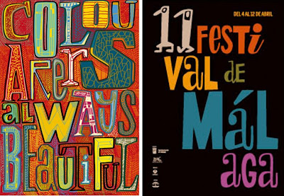 Post destacado 6
 Post destacado 7
 Post destacado 2
 Post destacado 3
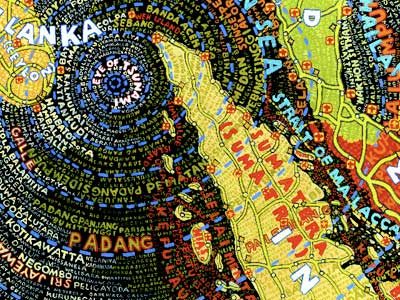 Post destacado 4
 Post destacado 5
 Post destacado 8
 Post destacado 9
I spend a day researching possible colour themes for my designs.


This post features the results of another mapping exercise.


News - updated daily, automatically generated by local media;
Events - community generated;
Board - an electronic, community generates notice board containing customer advertisements;
Maps - maps of the local area featuring community points of interests and local businesses (paid advertisement);
Faces - a social networking application allowing users to create an online profile, share their interests, archive posts and communicate with other users;
Talent Bank - an application allowing users to advertise their talents and/or special interests and exchange them for services of other users, for example spanish lessons in exchange for piano lessons.
Canvas - a simple application allowing users to draw and create similar artworks, and share them with other users via digital gallery;
Puzzle - an interactive game allowing multiple users to work together to create a big image by dragging and moving around its small pieces (all images to be sourced locally: landscapes, local photographers, local models);
Games - other similar games.
Food - an interactive database of grocery products available in the supermarket, alongside with recipes, food guides (cheese, fish, etc.) featuring dish of the day, ethnic foods, customers' comments and reviews;
Drink - a similar database showcasing wine of the day, information about grape varieties, origins, history, etc.;
Style - a guide to fashion available in stores that sell clothing, featuring latest fashion trends, accessories, customers' comments and reviews;
Books - a local readers' club, featuring books available in store, book of the week and customers' reviews;
Movies - a similar local fun-club for film, cinema, DVDs available in store;
Music - an application for all music-fanatics featuring expert and customers' reviews of music albums available in store as well as sample music tracks available for customers to listen;
Games - another application that enables users to review latest games releases, etc.
 I went today to see a few exhibitions at the V&A, the Science Museum and the Natural History Museum. And no, I was not going after the Indian Raj, not after the models of a spaceship and not after countless species of insects. I was chasing interactive, touch-sensitive screens, their design and technology. The trip has surely reinforced my believe in the digitalization of our world. It seems that if you want your exhibition to be successful you need to go for the interactive exhibits, something that people can play with, something that demands attention and provokes that 'wow' reaction. And clearly, you will need a digital notice board just to inform that a toilet is out of order.


 Some of the objects are designed particularly for group activities and people seem keen on it. There is a chance that the Mother Nature is not going to erase the herd instinct from our DNA anytime soon.


Project Outline
The HoneyHome.com is a design project that revolves around the notion of a community focal point. It challenges the argument that large retail corporations are destructive to local communities. Since a local supermarket is a physical place that every member of the community visits frequently, it could, potentially, play an important role in the community life. The HoneyHome.com recognizes that opportunity and seeks to bring together supermarkets, their customers and the existing local communities in order to provide a new-age community focal point.
The research into the existing and historic communities revealed that the nature of interaction between people is changing as a direct result of a rapid development in information and communication technologies. As the nature of human interactions changed, we moved away from the traditional model of community. In the ‘Digital Age’ the communities are no longer closed systems with clear geographic boundaries, stable memberships and few linkages with other communities. Instead, they are fragmented, geographically dispersed and, to a large extend, virtual or placeless.

I conducted some video research for examples of existing technologies for production of large touch screens as well as their various applications. I found out that this type of interactive screens are already quite affordable to purchase and are being used:
Digital kiosks are already widely used and it might be hard to imagine life without them. However, the experience of using a digital kiosk is very private and happens mostly in isolation.


"Community poster boards serve an important community building function. Posted fliers advertise services, events and people’s interests, and invite community members to communicate, participate, interact and transact" (Churchill, Nelson & Denoue 2003).
"blur the notional 'boundary' between virtual and physical locales of communication, and take advantage of the fact that relationships usually take place offline as well as online" (Churchill, Nelson & Denoue 2003).
 They also stimulate unplanned social interactions around digital content and provide opportunities for discovery of shared interests. In other words, the users don't interact with the content privately from their home PCs, but interact with the content in public and therefore have the opportunity to discuss it with other users on the spot. It reminds me of the "Memory Maps" and the notion of 'triangulation'.
Inspired by the Local Project's "Memory Maps" I thought about an interactive object that could:

So, what is the future of the publishing industry?
Despite the migration of many of our experiences to an online space, we're interested in how media plays a role in a real physical space. When that space is large, we delight in spectacular media installations that seamlessly integrate architecture and media. In physical environments of all sizes, we seek to facilitate connections between strangers. When our work becomes the instrument for dialogue between two visitors, we call that "triangulation," and we consider it one of the holy grails of our design work.


I began working on the Coverline Design mood board from identifying key words relevant to the company.
 I have looked at the existing design companies serving my field of interest. I realized that there is a number of large design companies which serve the market by providing photography as well as graphic designs for brochures, catalogues, direct mail, branding and websites design.
Also, there seems to be a lively market of freelancer proving work for various magazines.
 I did work a little more on the design company logo I started few weeks ago. Having attended a few design exhibitions (such as Mariscal Drawinf Life) and talks like Paula Scher's lecture at D&AD, I realised that what inspires me most is typography. Therefore, I tried to design a logo for my design business using typography. I was looking for something simple ("less is more") and easily recognizable. This is what I came up with and how I got there.

Communities are changing!
Just like our wardrobes are changing because fashion is subject to trends. Our customs and cultures we share are constantly being modified. Sometimes the change is slow and hard to notice. Sometimes social revolutions strike suddenly and rapidly.How are the communities changing and what are the factors that triggered the process?

 "Cyberspace has become a new kind of social terrain, crowded with ‘virtual communities'" (Anderson 1999). Geography is no longer the predominant force in shaping community. Most of the communities are fluid, some are placeless. People became multi-community individuals with many kinds of memberships.
Presenting my blog and project ideas to my colleagues and tutors today got me thinking about the future - the future of communities, the future of publishing and the future of retail corporations such as supermarkets.

 I have done a little research into the cost of printing a magazine. I used a simple quote form on Mixam Printing website to estimate that a 20-page, A4, Full-Colour magazine printed 90GSM coated paper with silk finish and a 150GSM cover would cost less than £1.
£872.70 for 1,000 copies (£0.87 per magazine)£1692.10 for 5,000 copies (£0.34 per magazine)£2312.20 for 10,000 copies (£0.23 per magazine)
1 Insertion | 4 Insertions | 7 Insertions | 12 Insertions | |
|---|---|---|---|---|
Full page colour | £1,155 | £1,039 | £982 | £924 |
Half page colour | £660 | £594 | £561 | £528 |
Quarter page colour | £410 | £369 | £349 | £328 |
Eighth page colour | £230 | £207 | £196 | £184 |
This application allows you to see the contents and the design of Waitrose Food Illustrated published by John Brown. Right-click on the picture and select 'Start Slideshow'.
Publishing a magazine, even the smallest one, costs a lot of money. I assume that the big supermarket chains would surely have the financial means to cover the expenses associated with printing since they already publish so much of brochures, leaflets, catalogues and even glossy magazines. However, if the new magazine I am working on is to be local and community-orientated, I need to think deeply about the costs of labour.
I thought about using the students of journalism from local universities who are always searching good work experience opportunities. I contacted Beth Brewster, the Director of Studies, Journalism & Publishing at Kingston University, and outlined my idea briefly asking for her expert opinion.
The outcome of our email exchange so far is outlined below:
1. Journalism in general is surely moving towards local markets with hyperlocal sites like Kings Cross Environment that deal with what's happening in local communities.
2. Having supermarkets sponsor the magazine is problematic because the sponsor would surely want to have an influence (and generally negative impact) on content. For example, I might never be able to run stories on certain new shops opening in the area if they are competitors.
3. There are more examples of sponsored local community magazines online, mostly because they are cheaper to produce than print publications. For example, Beckenham.com is sponsored by local estate agents. Although it has the appearance of being a community site it definitely has an 'agenda'.
4. Journalism students could be used as free labour as long as they are not exploited. They can't work for free for longer than four weeks so a skeleton permanent staff would also be needed to maintain consistency. My Village is run this way/.
I have also tried to get in touch with a friend of mine who works in Sainsbury's in order to arrange a meeting with the sore manager and run my idea through him. So far, I had no lack with getting anything back from him.
This diagram explains the local media's role in building and maintaining community. The local magazine serves as a platform for communication within the community, such as opinion exchange. debate about current issues and events etc. Therefore, the magazine supports a supermarket in fulfilling its role as a focal point of the community life.

According to Lena Calvert from the National Union of Journalists, the local media's role in keeping communities together is at risk. The recession caused severe cutbacks across most sectors of the industry. Small local media outlets are at risk of disappearing altogether due to lack of funds, decreasing advertising and newsstand sales.
...read more...
 There is a strong distinction between supermarket publications and other local magazines.
The first ones exist primarily to sell various products. They are used as marketing tools and, even if given away for free, aim to generate profits. But in order to get shoppers interested some publication offer other editorial content, such as lifestyle features, recipes or interviews with celebrity chefs, food critics, wine experts etc.
Local magazines claim to serve communities through news and features about local issues and events. However, being sponsored only by advertisement, they tend to be perceived more as the advertising platform for local businesses than a platform for objective editorial.
It seems that one publication cannot serve all communities by providing interesting editorial content, news, features, as well as advertisements and special offers on supermarket products.
I wonder why not...?
Out of the company names listed in previous post I selected two and started working towards designing a company logo.


Unfortunately, there seems to be an existing design company named Spread. Therefore, I will have to concentrate on an alternative name - Coverline.


This is my list of ideas for names for creative business:
1. Vistula Vision UnLimited - The name I used for my previous project. It incorporates the reference to the country of my origin ('Vistula' is the longest river in Poland) as well as the statement that my 'Vision' is not limited to the boundaries of any single country or discipline.
2. UnLimited - Shorter version of the previous name.
3. Fusion - It draws from the notion of fusion and blurring boundaries between journalism and design, between Polish and British influences, etc.
4. Studio DX - This abstract name does not carry any specific meaning other that the one you create in your mind for yourself. What does Studio DX mean to you?
5. Studio 44 - The number 44 carry very enigmatic meaning and has been often referred to in Polish mythology and romantic literature.
6. Design 44 - As above.
7. Punch Design - The name referring to cutting age, contemporary design.
8. Impact Design - Self-explanatory.
9. Absolute Design.
10. Total Design.
And finally...
11. Spread - The name obviously pointing towards designing magazine spreads and other forms of editorial design.
12. Coverline Design - Yet another reference to editorial design.


