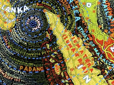
I spend a day researching possible colour themes for my designs.


Posted by
Katarzyna Matuszewska
19:18
I spend a day researching possible colour themes for my designs.


That's true. But 2 has also very little contrast. In my opinion a wall-size screen would look quite boring if it was made up of shades of yellow only.
Agree with Emil and Chrys on the 2nd one for a honeycomb theme, but would brighten everything on the palette. Say for example, if you had a colour breakdown of 20M, 80Y, 5K, I would push it up to 25M, 100Y and lose the black so that the colour is 'cleaner'.
Maybe you could introduce stark white as an accent colour and use the dark chocolate as well – together, you'd probably get really nice contrasts to play with. ;)
But how do you imagine a wall-size screen made up of shades of yellow only? It will look retro and I want contemporary or even futuristic!
Funny you should say that. Lol. I've actually designed a brochure before for networking products (think routers, technology, etc) using a hexagon motif (concept of networking derived from social insects = bees and honeycombs), and using the main colours of warm, vibrant yellow and a dark charcoal grey. With the white accents. And it managed to avoid looking retro, even if I say so myself. hahah
I found this on google, which might not be terribly useful but could give you an idea of how fresh and clean yellow could look http://carolinehenson.co.uk/blog/wp-content/uploads/2009/08/FilmLit1-500x265.jpg. And see if you can find this in the library - The Best of One- and Two-color Graphics http://www.amazon.co.uk/Best-One-Two-color-Graphics/dp/1592533027/ref=sr_1_1?ie=UTF8&qid=1259676274&sr=1-1-spell. I came across a version printed in 1997 years ago, and it was certainly handy.

This blog has been originally created to support learning and peer-to-peer interaction between the students and the teachers of MA Design for Communication course at the University of Westminster. It shows the progress of work on various academic, professional and personal design projects.
Coverline Design aspires to bridge the gap between the descriptive and the visual forms of communication. It promotes a stimulating cooperation between journalists and designers of contemporary media.
2008 Copyright Coverline Design


I like 2. - it's the warmest, most honey-like :o)