I wonder how often professional designers can't sleep because of their projects?

Posted by
Katarzyna Matuszewska
13:16
I wonder how often professional designers can't sleep because of their projects?


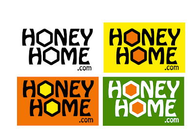
I like the yellow rectangle one, simple but very nice, highlight the letter "O" of the hive design.
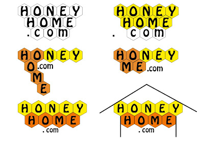
But above the combination bee cave is also interesting. In my personal opinion, if you can make sign "." integration of your logo will be better.
A strong logo is important as competition for customers increase day by day. It's vital to devote some time in creating your logo.
After all your logo is an icon and sign of your firm. Its part of your marketing communication and promotion something you don’t
want to be without. So let’s grab the people’s attention and leave footsteps of your firm in their hearts and mind through a unique
and special logo and guess what? “You are at the right place with the right people to do the right job” logo designs work" goal is
to help each firm to create a logo which can live within the hearts and minds of customers and clients. To create a logo so that a
firm can develop its own identity swiftly, competently and affordably. We have talked a lot, now its show time. Contact us and we
will show you what it’s all about.
http://logodesignswork.com
Excellent post ! You make some brilliant points very nice realization. keep it up

This blog has been originally created to support learning and peer-to-peer interaction between the students and the teachers of MA Design for Communication course at the University of Westminster. It shows the progress of work on various academic, professional and personal design projects.
Coverline Design aspires to bridge the gap between the descriptive and the visual forms of communication. It promotes a stimulating cooperation between journalists and designers of contemporary media.
2008 Copyright Coverline Design




wow... they all look so great... it's hard for me to choose one...from the square ones to down I like them all...OK I'm going to say the yellow rectangular with black fonts and orange + further down the vertical one...
they all are great... good luck