 Since I am interested in magazine design I look up for inspiration to big names of editorial designer. One of my favourite designers is David Curcurito, the Design Director of Esquite magazine.
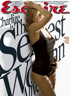
Since September 2006, Esquire has been defying the principles of Coverlines 101. It went against traditions of magazine cover design, against few easily readable coverlines referring to contents of the magazine by introducing type-heavy and largely illegible copy barraging almost every cover. This concept of "Vietnam Memorial" approach of Esquire is believed to originate from the editor David Granger's, but Curcurito is the one who has been executing the design and refining the style month after month.
According to DNR News, Esquire saw a 6.1 per cent increase in newsstand sales in the first half of 2007, which clearly indicated that the innovative approach was working.
The copycats of this unique style have appeared in everything from flyers to city and regional magazines and others. But, according to Foliomag.com, Curcurito welcomes them:
"It's a form of flattery," he says. "At first it was upsetting because I would have to continually reinvent the concept to stay ahead of the curve. But it keeps me on my toes."
Curcurito says he doesn't look around much at what other designers are doing, preferring to follow his gut. "But the ideas don't come from a dark corner of my brain," he says. "They come from social interaction with smart and fun people. I surround myself with great people who are as good as me if not better."
He particularly works well with Granger, he says, and enjoys their collaborative back-and-forth. "It makes the product smarter in the end. If I had all the answers myself, I don't know how comfortable I'd feel."
His advice to other designers: "Be confident in conveying these ideas. Know when to fight and when to back down." Also, "Take chances. Be smart but put your butt on the line."
Below you can see the selection of my favourite Esquite covers:
1. July 2009 - featuring coverlines painted on the women's naked body;
2. December 2008 - 3D effect coverlines with George Clooney right in front of them;
3. September 2008 - with its funky handwritten coverlines;
4. May 2008 - with this text on the cover: "We shot this image to catch your eye so you will pick up this issue...";
5. December 2007 - when Curcurito experimented with the name of the publication making it too big to fit on the page yet easily recognisable for a regular reader;
6. November 2007 - Esquire's Sexiest Women Alive coverline with the sense of linear perspective.


Thursday, 22 October 2009
TASK 1: Design Idols
Posted by
Katarzyna Matuszewska
12:28
About Me

- Katarzyna Matuszewska
- I grew up in a small town in Poland believing that the only boundaries that should not be crossed were those which I set up for myself. Now, living in the cultural blur of a cosmopolitan city I stick to that rule. I cross boundaries between cultures, languages, between print and web, between journalism and design in search of original creative fusions. I graduated from University of Westminster in 2010 with a Masters Degree with Distinction in Design for Communication. I also hold a First Class BA in Journalism with Media and Cultural Studies from Kingston University, which gives me a combined knowledge of editorial and design practices. Having previously worked for The Sunday Times Magazine, Haymarket and Think Publishing, I have experience in publishing and design industries and a strong passion for editorial design. I am a great (bilingual) communicator, a competent writer and a designer. I produce imaginative magazine layouts to convey the publication‘s editorial mission and specialise in magazine launch and redesign projects. If you think your organisation could benefit from my knowledge and experience, please get in touch.
Blog Archive
Followers
Labels
- Advertising (1)
- Book Design (7)
- Business for Design (8)
- Colour (2)
- Community (7)
- Critical Debates in Design (9)
- Design Authorship (8)
- Design Inspirations (1)
- Design Project B (7)
- Design Research Methods (8)
- Environment (5)
- Ethics (5)
- Honeycomb (3)
- Interactivity (7)
- Logo (4)
- Market Research (3)
- Master Project (1)
- Personal Projects (1)
- Printing (1)
- Project Brief (4)
- Redesign (1)
- RSA (24)
- Tasks (17)
- Touch Screen (11)
- Typography (3)


