So, I am officially writing a book about Nothing and the deeper I go into the subject the more interesting it becomes to me. From time to time I will ask you guys for a little help. Right now, I am thinking about the colour of Nothing. In my survey I asked people what they think about when they say they think about Nothing. A few of the respondents gave me a colour: black, grey, yellow, blue, dark blue, green, white. It's quite a range, would you agree?
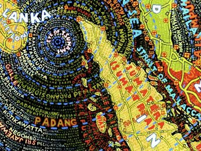
It got me thinking... Nothing has different colours for different people. I decided to find out more and came up with a little experiment. I want to know what colour is Nothing according to you! Look at the colour palette below and find the colour that represent Nothingness to you. Write down the reference numbers of that colour in the comments box. Remember to give HORIZONTAL number FIRST (from 19.0.5 to 19.0.1) and the VERTICAL number SECOND (from 010 to 10). Please note that shadows of grey have only ONE horizontal reference number.
For example, light blue is 25:02 while barbie pink is 13:1.
Along withe the reference number please give you age and sex. I am going to find out if there is a relationship between age, sex and the colour of Nothing. I will also try to calculate an average from all the responses to indicate the average colour of nothing! It will be used in the design of my book.
Good luck and I hope you will enjoy yourself. I am looking forward to see your responses.
Click on the image to see it better.
Thursday, 4 March 2010
What is the Colour of Nothing?
Posted by
Katarzyna Matuszewska
12:28
About Me

- Katarzyna Matuszewska
- I grew up in a small town in Poland believing that the only boundaries that should not be crossed were those which I set up for myself. Now, living in the cultural blur of a cosmopolitan city I stick to that rule. I cross boundaries between cultures, languages, between print and web, between journalism and design in search of original creative fusions. I graduated from University of Westminster in 2010 with a Masters Degree with Distinction in Design for Communication. I also hold a First Class BA in Journalism with Media and Cultural Studies from Kingston University, which gives me a combined knowledge of editorial and design practices. Having previously worked for The Sunday Times Magazine, Haymarket and Think Publishing, I have experience in publishing and design industries and a strong passion for editorial design. I am a great (bilingual) communicator, a competent writer and a designer. I produce imaginative magazine layouts to convey the publication‘s editorial mission and specialise in magazine launch and redesign projects. If you think your organisation could benefit from my knowledge and experience, please get in touch.
Followers
Labels
- Advertising (1)
- Book Design (7)
- Business for Design (8)
- Colour (2)
- Community (7)
- Critical Debates in Design (9)
- Design Authorship (8)
- Design Inspirations (1)
- Design Project B (7)
- Design Research Methods (8)
- Environment (5)
- Ethics (5)
- Honeycomb (3)
- Interactivity (7)
- Logo (4)
- Market Research (3)
- Master Project (1)
- Personal Projects (1)
- Printing (1)
- Project Brief (4)
- Redesign (1)
- RSA (24)
- Tasks (17)
- Touch Screen (11)
- Typography (3)


Nothingness in nature - I would go for colourless (although it is quite a rare thing in nature - but let's not get into quantum physics :)).
Nothingness, in its more human meaning - like when you think about nothing - the colour for that would be black.