DESIGN IS A BEHAVIOUR / NOT A DEPARTMENT

Thursday, 17 December 2009

What is this?
This is a copy of the presentation I gave today for my peers in the MA Design for Communication class. It uses a very new and innovative technique that I learnt recently from Liana. It is very simple to use, yet looks dynamic and very exciting. It doesn't present slides in linear order like PowerPoint. It's more user-oriented and interactive. Think about it as a big canvas when you can zoom in and out on different object.

How to view the presentation?
There are two methods you can use to view the presentation. Whichever you choose, open the presentation in the full-screen mode first by clicking on the button in the bottom right corner of the window.
Then, (1) simply press the 'play' button in order to process with the presentation in order we viewed it in the classroom. But remember, the presentation was interactive and viewers could choose the places they wanted to visit first on the map of the world.
Therefore, I would recommend that you view the presentation in the order of your individual choice (2). It's like a journey around the world! You can zoom in on any object (picture, text, frame) by clicking on it. Zoom out by pressing the 'space' button on your keyboard. Be adventurous and explore. I am sure you will have a lot of fun with it.

The word of introduction before you start exploring
I chose ethnic masks as a subject of my presentation because I am very interested in original and 'pure' culture. I am attracted to 'pure' custom, tribal traditions, cultures that evolved in isolation from Western influences.
And there is something incredibly mysterious and enigmatic about masks. They are used for protection from real and imagined dangers, for concealment, performance or amusement.
Masks have been used since antiquity for both ceremonial and practical purposes. They are usually worn on the face, although they may also be positioned for effect elsewhere on the wearer's body, so in parts of Australia giant totem masks cover the body, whilst Inuit women use finger masks during storytelling and dancing.
Throughout the world masks are used for their expressive power as a feature of masked performance - both ritually and in various theatre traditions. Masks are also a familiar and vivid element in many folk and traditional pageants ceremonies, rituals and festivals, and are often of an ancient origin. The function of the masks may be magical or religious; they may appear in rites of passage or as a make-up for a form of theatre. Equally masks may disguise a penitent or preside over important ceremonies; they may help mediate with spirits, or offer a protective role to the society who utilizes their powers.

The presentation is also available online at:


My collection
Finally, this is a pick from my personal collection. They are not the original tribal artworks. I buy them on ebay. They were probably produced as souvenirs for tourists, but still, I find them fascinating and inspiring.


After weeks of intensive work I have submitted my boards for the RSA 2009/10 competition.
Below you will find the presentation of my project along with the project report I also submitted.


Project Report

The HoneyHome.com is a design project that revolves around the notion of a community focal point. It challenges the argument that large retail corporations are destructive to local communities. Since a local supermarket is a physical place that every member of the community visits frequently, it could, potentially, play an important role in the community life. The HoneyHome.com recognizes that opportunity and provides a new-age community focal point by introducing a new channel for multilevel communication, called ‘The Hive’.

The research into the existing and historic communities revealed that the nature of interaction between people is changing as a direct result of a rapid development in information and communication technologies. As the nature of human interactions changed, we moved away from the traditional model of community. In the ‘Digital Age’ the communities are no longer closed systems with clear geographic boundaries, stable memberships and few linkages with other communities. Instead, they are fragmented, geographically dispersed and, to a large extend, virtual or placeless.

I began to investigate the methods of restoring the lost community focal point locally by improving the communication between communities, supermarkets and individuals. Taking into consideration the role of local media in building and maintaining communities, I thought about designing a local magazine produced by the collaboration of a supermarket with journalism and design students from a local university. It seemed to solve the problem temporarily, but a steady decrease in popularity of print media made me look at digital and more future-friendly alternatives.

Inspired by an ever-increasing use of tangible technologies in our everyday life, I decided to design a digital device, which would create and reinforce links between local communities, supermarkets and their customers. And my idea - The Hive – took a form of a wall-size, multi-touch screen that allows several users to interact with its contents and with each other at the same time.

The very concept of networking derived from social insects, such as ants and bees, therefore, I based the interface design around a simple graphic representation of a honeycomb - the hexagon motif. It represents collaboration and, therefore, illustrates the key characteristic of a vibrant community. The honeycomb inspired the project name and the colours used for the campaign development.

HoneyHome.com does not require extensive advertising. The target audience comes to supermarkets regularly and a wall-size tangible device is almost certain to create a positive buzz within the community. However, in order to encourage people to use ‘The Hive’ and the associated website, a number of promotional activities are recommended.

The campaign logo with a catchy slogan, for example “Sweetening Your Local Community” or “Buzzing With Activity”, could be printed on carrying bags or on shopping baskets and trolleys. Similarly, locally sourced honey could be used for promotional purposes. A label branded with HoneyHome.com logo would inform people about the new service. Given away for free at the launch of the campaign, the honey would also help to leave a sweet and homely flavour on the community taste buds.

Wednesday, 2 December 2009

I wonder how often professional designers can't sleep because of their projects?


I can't sleep almost every night. I go to bed and as soon as I close my eyes the images of my project attack me from everywhere.

Sometimes, it is not such a bad thing. Apparently, the middle-of-the-night ideas might be quite useful as they are normally a little detached from what we're working on.

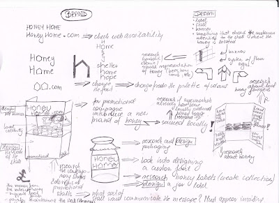
Yesterday, one of those midnight persuasive thoughts made me change the title of the project from the 'Community Honeycomb' to 'Honey Home' only because the second one rhymes with 'dot.com'.

So I could have 'HoneyHome.com' and my Touch Screen Wall was meant to be accompanied by a website anyway. But this is just a beginning. I could design a campaign logo, banner, floor signs, promotional stall... even a honey jar and label that promotes the idea but also generates profit (needed in order to pay for administrator and maintenance of the Wall).

Searching for 'honey' on Waitrose.com returns over a hundred results. Surely, one of those honey jars could be locally sourced and labeled as 'Honey Home'.

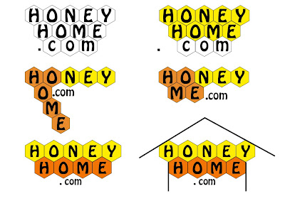
Following the night-time stroke of genius (ha, ha!!!), I started working on potential logos for my project.


Which style will work best for my project?

Monday, 30 November 2009

I was trying to pick fonts for my project. I am looking for something contemporary but quite simple and soft at the same time.

This are some suggestions.


Which one do you like?

Sunday, 29 November 2009

I spend a day researching possible colour themes for my designs.

And, I discovered Kuler! This fantastic web-based software allows users to browse through existing colour themes as well as create new ones. It can also convert an image into a palette which I found very useful.

I was not only thinking about colours for the actual touch screen, but also for the boards I will design to enter the RSA competition.

Since my project will have a symbolic association to honeycomb, I tried to concentrate on warm orange range. I wanted something contemporary, fresh, vibrant, warm...

This are a few palettes I created. Your comments and suggestions are as always appreciated. Help me choose the right one.


1. Muted grey and orange from oriental print.


2. Honey Bees - shades of yellow, beige and brown.


3. Late Summer Evening - vibrant green and orange with a hint of grey.


4. Summer Night - a follow up on the Late Summer Evening theme; it includes black and light grey.

Friday, 27 November 2009

I have been working recently on the design for icons representing different applications (functions) of my touch-screen on its home screen. Initially, I was inspired by the idea of the 'Community DNA', therefore, I designed hexagon-shaped icons.

After presenting the work to my tutors today, I realized that the term 'DNA' is somehow very scientific. It almost sounds to difficult to fully understand. And there is a possibility that an average supermarket customer might think that the entire idea is somehow too complicated to follow. The fear of the unknown...?! Maybe.

They suggested a simpler concept: 'Comunity Honeycomb'.

As opposed to difficult, clinic and unknown DNA, honey has very positive associations: it's sweet, it's natural, healthy. It's touchable and smells nice. It's sticky so can stick members of the community together. It's edible and available in supermarkets, familiar to all customers. And still, it could be represented by a network of hexagons. Honey is GOOD!

I did a quick visual research for the concept and found some excellent applications of it.

Honeycomb, originally applied to web design, is being used to visually represent the key characteristics of a good user experience design.

In relation to my project, a wall-size, multi-user, multi-touch screen needs to be:
  • Useful - All potential supermarket customers should feel the need to use the device;
  • Usable - The device should be easy to use for someone with a minimum or none computer knowledge (children and the elderly);
  • Desirable - The screen should look attractive and tempting (trendy);
  • Valuable - The device should be valued among its users (but it will only be possible if the device responds to the community needs, serves the community);
  • Findable - It surely needs to be easy to locate (and there is no better place to put the thing that a supermarket becauce supermarkets have been playing the role of the community focal point for a while now);
  • Accessible - The screen needs to be placed close to main entrance in order to make sure that every customer walking through that door notices it, but also, to attract passers-by.
  • Credible - And obviously, all the information available for the screen's users should be reliable. The screen's administrator (there surely should be one) would have to be responsible, as much as possible, for checking the information.


The honeycomb structure can be customized. I found another example where it has been applied to retail. The characteristics (useful, usable, desirable, valuable, findable, accessible and credible) have been replaced with: presence, sharing, relationship, identity, conversations, reputation and groups.


I also got inspired by a diagram illustrating the cycle of information architecture. The author claims that on every project there should be an a 'unique balance' between business goals, user needs/behaviours and available content.


I think of actually using this very simple diagram to illustrate the 'unique balance' between the goals of supermarkets (increasing sales and/or attracting new customers), customers' expectations (community needs) and the available content.

Thursday, 26 November 2009

This post features the results of another mapping exercise.

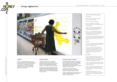
I consolidated my research by looking into important issues surrounding the design of a wall-size, touch-screen device for community communications.
I considered:
  • location,
  • audience,
  • contents,
  • practices around contents,
  • community functions.


I listed various functions the device could fulfill and grouped them into three major categories:
  1. Community:

    News - updated daily, automatically generated by local media;

    Events - community generated;

    Board - an electronic, community generates notice board containing customer advertisements;

    Maps - maps of the local area featuring community points of interests and local businesses (paid advertisement);

    Faces - a social networking application allowing users to create an online profile, share their interests, archive posts and communicate with other users;

    Talent Bank - an application allowing users to advertise their talents and/or special interests and exchange them for services of other users, for example spanish lessons in exchange for piano lessons.

  2. Activity:

    Canvas - a simple application allowing users to draw and create similar artworks, and share them with other users via digital gallery;

    Puzzle - an interactive game allowing multiple users to work together to create a big image by dragging and moving around its small pieces (all images to be sourced locally: landscapes, local photographers, local models);

    Games - other similar games.

  3. Shopping:

    Food - an interactive database of grocery products available in the supermarket, alongside with recipes, food guides (cheese, fish, etc.) featuring dish of the day, ethnic foods, customers' comments and reviews;

    Drink - a similar database showcasing wine of the day, information about grape varieties, origins, history, etc.;

    Style - a guide to fashion available in stores that sell clothing, featuring latest fashion trends, accessories, customers' comments and reviews;

    Books - a local readers' club, featuring books available in store, book of the week and customers' reviews;

    Movies - a similar local fun-club for film, cinema, DVDs available in store;

    Music - an application for all music-fanatics featuring expert and customers' reviews of music albums available in store as well as sample music tracks available for customers to listen;

    Games - another application that enables users to review latest games releases, etc.

Friday, 20 November 2009

I went today to see a few exhibitions at the V&A, the Science Museum and the Natural History Museum. And no, I was not going after the Indian Raj, not after the models of a spaceship and not after countless species of insects. I was chasing interactive, touch-sensitive screens, their design and technology. The trip has surely reinforced my believe in the digitalization of our world. It seems that if you want your exhibition to be successful you need to go for the interactive exhibits, something that people can play with, something that demands attention and provokes that 'wow' reaction. And clearly, you will need a digital notice board just to inform that a toilet is out of order.


The new space at the Natural History Museum was full of interactive toys far more advanced that those in 'The Future' section of the Science Museum. There were more touch screens than insects in 'The Cocoon' and some of them really wowed.

An image projected on what looks like an ordinary table, by what looks like an ordinary projector, can actually respond to your
touch! And to use this stuff you don't need a PhD in Computer Science. It actually is people-centered and elderly-friendly. The lady in the picture is enjoying herself and she is not in her spring!


The digitalization is not aiming higher! In the literal meaning, of course. Interactive touch-screens are 'the thing' among kids too. Just look at these delightful little cyber-addicts: they can hardly walk but are quite comfortable with digital interfaces.
But, what is really nice to see is that they actually interact with one another as much as they do with digital media.
Some of the objects are designed particularly for group activities and people seem keen on it. There is a chance that the Mother Nature is not going to erase the herd instinct from our DNA anytime soon.
I really get excited thinking how people might react when they see that massive multi-touch screen I am now designing for supermarkets. Will they be similarly wowed? Will they interact with each other?

The visit also made me aware that there are different levels of interactivity:
  1. (Inter)active reading - this is when you consciously read the digital content, absorb the information;
  2. Navigating and Browsing - this is when you browse through menus, searching for more information, seeing what other functions are, etc.;
  3. Messaging - this is when you actively participate in the content generation by posting comments under other pieces of information, when you express your own opinion or participate in a debate. Also, when you forward the information to someone else, share it.
The interaction of the third kind is clearly the most valuable in terms of building and maintaining communities and should be encouraged on my supermarket touch-wall.

QUIZ
It's time for a little quiz for you. Below, you will find several photographs taken during today's trip. Identify the levels of interaction represented by the pictures. Post your answers in the comment box.


Project Outline

The HoneyHome.com is a design project that revolves around the notion of a community focal point. It challenges the argument that large retail corporations are destructive to local communities. Since a local supermarket is a physical place that every member of the community visits frequently, it could, potentially, play an important role in the community life. The HoneyHome.com recognizes that opportunity and seeks to bring together supermarkets, their customers and the existing local communities in order to provide a new-age community focal point.

The research into the existing and historic communities revealed that the nature of interaction between people is changing as a direct result of a rapid development in information and communication technologies. As the nature of human interactions changed, we moved away from the traditional model of community. In the ‘Digital Age’ the communities are no longer closed systems with clear geographic boundaries, stable memberships and few linkages with other communities. Instead, they are fragmented, geographically dispersed and, to a large extend, virtual or placeless.

With the HoneyHome.com project I aim to introduce a new supermarket service that would reflect the idea of extensive multilevel communications within local communities. I intend to develop: a design concept, a multimedia device, a supplementary website and a campaign.

The HoneyHome.com concept is based on the idea of networking which derived from social insects such as ants and bees. The design uses a simple graphic representation of a honeycomb – the hexagon motif. It represents collaboration and, therefore, illustrates the key characteristic of a vibrant community.

Inspired by an ever-increasing use of tangible technologies in our everyday life, I decided to design a digital device, which would create and reinforce links between local communities, supermarkets and their customers. And my idea - The Hive – took a form of a wall-size, multi-touch screen that allows several users to interact with its contents and with each other at the same time.

Users could interact with the device and its content on many levels. The users’ comments, adverts, images can be uploaded from a USB stick or from a personal computer via the HoneyHome.com website, which would also allow the users to access the contents from any place at any time. The contents could be saved to users’ profiles or forwarded to others via email.

The device and the website will be supported by a ‘Sweet Campaign’. The campaign logo with some catch slogans could be printed on carrying bags or on shopping bags and trolleys. Similarly, locally produced honey could be used for promotional purposes.


I have used blogging before to illustrate the progress of projects I worked on during my undergraduate degree in Journalism with Media & Cultural Studies. I was already familiar with the Blogger.com.  I started by adopting my existing template. With its black background and white texts, it looked simple and amateurish. But this time I was to create a blog suited for designers so I needed to improve it.

I started by searching for a suitable template on Btemplates. I chose the Magazeen template created by the WeFunction Design AgencyThis bold magazine 2-col-theme was designed with the main focus being on typography, grids and magazine-look. It is very functional, attractive and modern. 

After downloading, I worked on the template’s html code to customize it. I included the following elements:
  • Blog title – I used the research I carried for the Business for Design module and called my blog Coverline Design.
  • Strapline – “Where Design Meets the Editorial” – which reflects my prime interests in editorial design and visual journalism.
  • Navigation bar – buttons allowing user to view the blog’s home page, posts RSS, all comments and edit the blog.
  • Motto – “Design is a behavior/Not a department”.
  • Image showcase – it was design to show thumbnails of images from posts, which could take the viewer to the original posts. However, I used it to show the examples of work of other designers that I find particularly inspiring.
  • Widgets – About Me, Blog archive, Followers, Labels (which are very useful while searching for a particular post, topic or trend) and Blogroll.
  • Categories (in the Footer) – an extremely useful tool for a viewer interested only in postings related to a particular academic module (Design Project A (RSA), Business for Design and Design Research Methods).
  • About this blog  - a short introduction to the purpose of the blog.

I conducted some video research for examples of existing technologies for production of large touch screens as well as their various applications. I found out that this type of interactive screens are already quite affordable to purchase and are being used:

  • by museums for exhibitions (Science Museum, London),
  • by schools and universities for educational purposes,
  • by entertainment industry for various touch-based games,
  • by corporate organizations for information sharing.
Below, I posted some You-Tube examples and my comments regarding their possible application in supermarkets.


1. This video explains very well how the idea of wall-size screen might work. Classic touch-screens have theirs limitations: (A) they tend to be small as their price increases significantly with the size; and (B) they can be used by a single user only. However, the use of infra-red light technologies removed those limitation and allowed the development of simple, self-explanatory, interactive systems that could be controlled by natural gestures (no more clicking) without any extensive computer literacy.


2. My idea for the use of wall-size screen in supermarkets was to have a variety of things each user could use it for. I imagine it as a set of different applications that users could activate and interact with. For example, a small child uses drawing application, a teenager checks out a game, a mother downloads new recipes and a father reads local news and community adverts. And they can do all those things at the same time. Just like an iPhone does not come with a set functions but each user can download different applications to suit individual needs.
I saved the above video because it prompts how those applications (icons) could be browsed through.


3. This video presents an interactive touch-sensitive table that could be used for literacy exercises. There are no graphic (except letters), the numbers of users and possible applications are limited. But, what I like about it is that it uses natural gestures only. So, no clicking, no icons, no buttons, no commands! If you want to accept a word, you don't hit ENTER or NEXT button but you circle it with your finger.


4. This is another, far more advanced version of interactive table. I liked it because it allows several users to work together. For example, all users could draw over the same document. This is so community-friendly. I could picture one person starting to play with gigantic on-screen puzzles by dragging the pieces around and other people joining in to help. The possibilities of communal use are endless.

Digital kiosks are already widely used and it might be hard to imagine life without them. However, the experience of using a digital kiosk is very private and happens mostly in isolation.

The questions are:
How can we use touch-screen technology, such as digital kiosks, to benefit the local community?
How could the users be encouraged to interact with each other?

My observation of existing community communications indicate that people are constantly seeking the means of communicating with neighbours and other people living locally. They do it via local print and web publications (classified advertisements) as well as through community notice boards.

These community notice boards can be found in various public places such as launderette, bus stops, workplace corridors, but also 'corner shops' and SUPERMARKETS.

"Community poster boards serve an important community building function. Posted fliers advertise services, events and people’s interests, and invite commun
ity members to communicate, participate, interact and transact" (Churchill, Nelson & Denoue 2003).

But, as we moved into the 'digital era' these old fashioned boards are being replaced with digital ones that display community-generated, interactive multi-media content in the physical environments. As oppose to web-based notice boards, these physical, touchable objects

"blur the notional 'boundary' between virtual and physical locales of communication, and take advantage of the fact that relationships usually take place offline as well as online" (Churchill, Nelson & Denoue 2003).

They also stimulate unplanned social interactions around digital content and provide opportunities for discovery of shared interests. In other words, the users don't interact with the content privately from their home PCs, but interact with the content in public and therefore have the opportunity to discuss it with other users on the spot. It reminds me of the "Memory Maps" and the notion of 'triangulation'.

The digital kiosks and interactive digital community boards
have had a deep impact on my RSA project since I decided to look into the communities of the future and the future of communication within those communities. I want to design a completely new genre of communication: a wall-size, digital and interactive touch screen that could be placed in supermarkets. It would not only inform the community members, communicate important messages, but also stimulate interactions between individual users.

References:
Churchill, E.F., L. Nelson & L. Denoue (2003) Multimedia Flyers: Information Sharing with Digital Community Bulletin Boards [Online]. Available at: http://www.fxpal.com/publications/FXPAL-PR-03-198.pdf (Accessed: 16 November 2009).

Thursday, 19 November 2009

Inspired by the Local Project's "Memory Maps" I thought about an interactive object that could:

  • Be physically located in a public space, such as supermarket, in order to enable physical interaction between its users;
  • Fulfill the same role in building and maintaining communities that local magazines and newspapers play;
  • Yet, be inexpensive to maintain (minimum labour costs, no printing costs);
  • Be environment-friendly (minimal or none waste);
and
  • Be future-friendly!!!
The solution seemed obvious!


The pictures above illustrate several variations of widely used digital kiosks - computer terminals that provide information access via electronic methods:
  1. Movie tickets kiosk;
  2. Telephone kiosk;
  3. Vending kiosk (for DVD rentals and libraries);
  4. Visitor Management and Security Kiosk (airports, GP's surgeries);
  5. Photo kiosk;
  6. Giving kiosk;
  7. Internet kiosk;
  8. Financial services kiosk (cash machines);
  9. Building directory & way finding kiosk (shopping malls, airports).
There is a variety of ways this digital kiosks could be used in supermarket, especially if we design a device that could combine more than one of the above functions.

But if we were to provide long-term community service, we've got to look further than that.
How would digital kiosk be used in the future?
How could they serve the local community?
How could they allow for the interaction between many users?

If you are interested in this sort of interactive device and wish to have a closer look into latest design and technology developments, have a look at the blog below:

So, what is the future of the publishing industry?

Will it move completely into the cyberspace?
Will we read magazines from our ever-minimizing computer/mobile phone screens? In isolation? In virtual reality?
If so, how does it going to affect our communities and community spirit?

I tend to believe that community bonds, in the traditional sense of the word, are formed via personal or at least semi-personal interactions among individuals. Even if the interactions are stimulated or mediated using digital technologies.

During my research for the project I came across a media design firm called Local Projects. On their website they claim that although technology facilitates their work, storytelling is at its heart:


Despite the migration of many of our experiences to an online space, we're interested in how media plays a role in a real physical space. When that space is large, we delight in spectacular media installations that seamlessly integrate architecture and media. In physical environments of all sizes, we seek to facilitate connections between strangers. When our work becomes the instrument for dialogue between two visitors, we call that "triangulation," and we consider it one of the holy grails of our design work.


I got particularly interested in one of their projects called "Memory Maps" where they constructed a structure similar to subway car with large maps of the city inside. People were invited to go in, write up the memories they associated with various parts of the city on small pieces of paper and pin them on the maps. The surprising outcome of the installation was that complete strangers interacting with the structure started talking to each other and share their personal experiences.

Jake Barton from Local Projects called it "triangulation", which is precisely what I am after in my RSA project. Watch the clip!


Wednesday, 18 November 2009


I began working on the Coverline Design mood board from identifying key words relevant to the company.

Then, I searched for images representing those words and created a puzzle-like collage to show that all those elements are inter-related.

The shapes of human faces incorporated in the image symbolize the process of communication that can only be completed by Coverline Design.

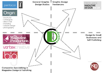
I have looked at the existing design companies serving my field of interest. I realized that there is a number of large design companies which serve the market by providing photography as well as graphic designs for brochures, catalogues, direct mail, branding and websites design.

Also, there seems to be a lively market of freelancer proving work for various magazines.

In addition, there is a few of design companies specializing in magazine design and publishing. They offer ongoing work on existing publications, rebranding/redesign of existing publications, as well as launching new magazines.